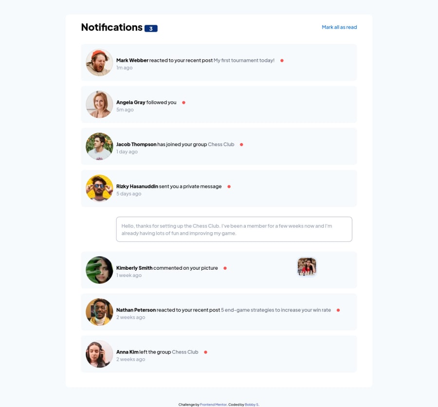


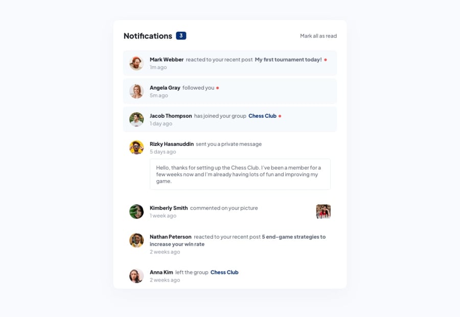
Design comparison
Solution retrospective
The javascript was challenging for me. Also some of the UI was challenging. I really need to work on the responsiveness too. I tried to use SASS but I could not install on my computer successfully. I know the responsiveness is off and the grid layout is not perfect. But I think it turned out ok. I tried using BEM naming conventions which made the class names really long so I stopped along the way. I may try BEM in the future again.
Community feedback
- @al-ameen36Posted over 2 years ago
hello Bobby
A few suggestions
- I usually use Grids to make complex layouts or when i know the sizes i want my columns to be, else i just use FlexBox to align items horizontally.
- I also try to give my HTML elements very meaningful and intuitive names like
notificationandnotification__item. - Designing mobile first makes responsive design easier.
- I use semantic HTML elements as much i can.
<main class="container">
    <header class="notification__header">
        <h1>Notifications
            <span id="notification-count" class="badge">3</span>
        </h1>
        <button id="readAll-btn" class="btn">Mark all as read</button>
    </header>
    <section class="notification">
        <article class="notification__item unread">
            <picture class="user__image"><img src="images/avatar-mark-webber.webp" alt=""></picture>
            <div class="notification__content">
                <h2 class="user__name"><a href="#">Mark Webber</a></h2>
                <p class="notification__text">reacted to your recent post
                    <a href="#">My first tournament today!</a>
                </p><span class="dot"></span>
                <time>1m ago</time>
            </div>
        </article>
    </section>
</main>
w3shools.com is a great resource i use for learning, it provides you great examples and a try-it editor for practice. Here are some useful links i recommend
I hope this is helpful, you can always ask for clarification. Good luck
Marked as helpful0

Please log in to post a comment
Log in with GitHub
Join our Discord community
Join thousands of Frontend Mentor community members taking the challenges, sharing resources, helping each other, and chatting about all things front-end!
Join our Discord