Design comparison
SolutionDesign
Solution retrospective
What are you most proud of, and what would you do differently next time?
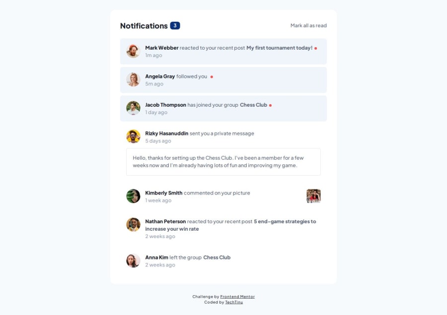
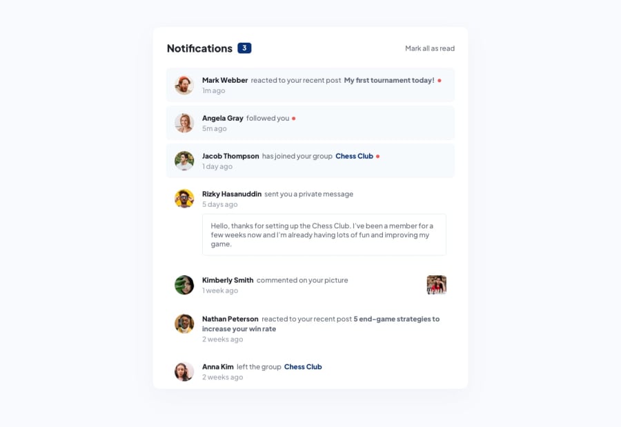
I used this project as a lightweight practice of VueJS. This also required coming up with a data structure--rather than hardcoding the markup--that the app could use and render.
Each unread notification can be toggled to "read" status individually; or as a group with the "Mark all as read" label. When all notifications are "read", the label is hidden. Refresh the page to reset the dashboard.
Overall, a solid and straightforward junior challenge.
Community feedback
Please log in to post a comment
Log in with GitHubJoin our Discord community
Join thousands of Frontend Mentor community members taking the challenges, sharing resources, helping each other, and chatting about all things front-end!
Join our Discord
