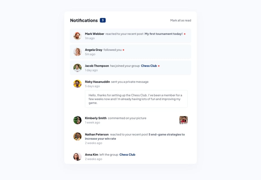
Notifications page using React framework
Design comparison
Solution retrospective
I liked this project for being able to practice useState in an isolated environment. Also, already with this scope CSS becomes quite inconvenient to use, so I would rather use SCSS for similar projects.
Community feedback
- @denieldenPosted over 2 years ago
Hello Katja, You have done a good work! 😁
Some little tips to improve your code:
- add
maintag and wrap the card for improve the Accessibility - use
p, strong, h1, h2, h3tags instead of a simpledivfor the texts inside notification - remove all unnecessary code, the less you write the better as well as being clearer: for example the
picturecontainer of image...picturetag is good to change image by resolution -> read here
Keep learning how to code with your amazing solutions to challenges.
Hope this help 😉 and Happy coding!
Marked as helpful1@katjadanilovaPosted over 2 years ago@denielden Thanks, Deniel, for your comments. I finally had time to get back to this small project, and implemented some of the changes you recommended, and improved accessibility - indeed, a very important step!
1 - add
Please log in to post a comment
Log in with GitHubJoin our Discord community
Join thousands of Frontend Mentor community members taking the challenges, sharing resources, helping each other, and chatting about all things front-end!
Join our Discord
