Design comparison
Solution retrospective
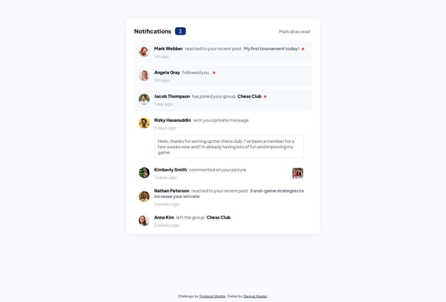
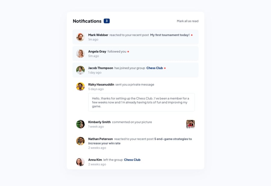
I started by creating all the HTML elements and assigning them classes. Next, I started to work on the card where I added things like box shadows, notifications, and padding. Then, I moved onto the text, where I spent time getting the colors, sizes, and styles right for everything. I then moved onto the profile pictures, where I used proprties such as position: relative, and margin to get the spacing and design right. I used spans to create the messages, and used margin left and right to create spaces between each piece of text. I created the red dots for notifications, and styled them accordingly. Once I was done, I started to create the design for the entire page. I used flexbox to center everything, and spent some time playing around with the padding and margin for the notifications. I had some issues with card 4, so I used the dev tools to delete the other notifications. I worked on the design, and used things like margin, and visual cues to isolate issues and spacing. Lastly, I added some very basic Javascript to add the ability to mark all notifications as read. Once I finished, I tested the website on multiple browsers, added some responsive design using media queries, and used the built-in device size emulation feature to view what the website would look like on different devices.
Community feedback
Please log in to post a comment
Log in with GitHubJoin our Discord community
Join thousands of Frontend Mentor community members taking the challenges, sharing resources, helping each other, and chatting about all things front-end!
Join our Discord
