Design comparison
SolutionDesign
Community feedback
- @NehalSahu8055Posted over 1 year ago
Hello Coder 👋.
Congratulations on successfully completing the challenge! 🎉
Few suggestions regarding design.
- Use
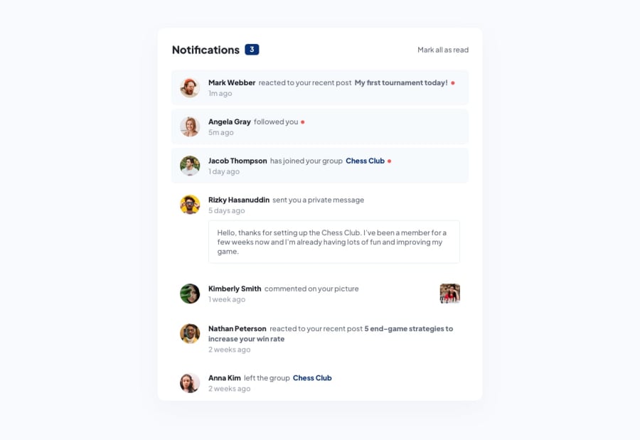
position : relativeinstead of absolute as pic get displaced out of card.
.chess-picture { position: relative; /* position: absolute; */ left: 150px; cursor: pointer; }-
Use
responsive units(rem, em, %)from next project. Explore respective use cases on google. -
Replace
widthwithmax-widthto make your card more responsive.
link.
I hope you find this helpful.
Happy coding😄
Marked as helpful0 - Use
Please log in to post a comment
Log in with GitHubJoin our Discord community
Join thousands of Frontend Mentor community members taking the challenges, sharing resources, helping each other, and chatting about all things front-end!
Join our Discord
