Design comparison
SolutionDesign
Solution retrospective
What are you most proud of, and what would you do differently next time?
I am most proud of how I proceeded with laying out my HTML and making sure I understood the layout before proceeding to styling it with CSS.
Next time, I would try to use less div to make the code more readable and maintainable.
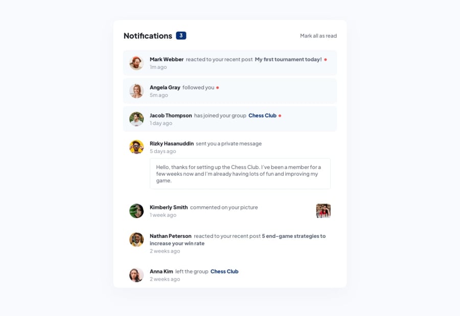
What challenges did you encounter, and how did you overcome them?A challenge I encountered was getting the number of notifications to be 7 when you clicked the button for the second time. I couldn't get my JS to set the number correctly.
The solution was to change the length of the notification div to a string by using the toString() method.
Community feedback
Please log in to post a comment
Log in with GitHubJoin our Discord community
Join thousands of Frontend Mentor community members taking the challenges, sharing resources, helping each other, and chatting about all things front-end!
Join our Discord
