Design comparison
Solution retrospective
I'm proud of using an object to map through in order to create the props passed down to each notification item.
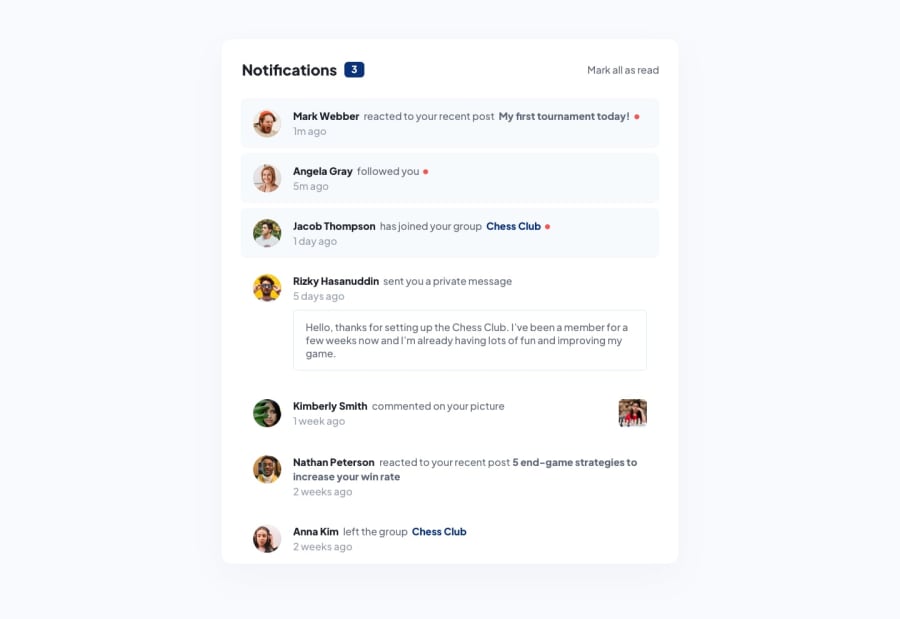
What challenges did you encounter, and how did you overcome them?The styling of the notification item component was difficult as there were both similarities and differences between each component. I used conditional rendering (&&), ternery operators to render specific elements and classes.
What specific areas of your project would you like help with?The image in Kimberly Smith is meant to be pushed all the way to the end. In each item I have display: flex, however am unable to move a single element all the way to the end. I'm not sure how to get around this problem. Open to suggestions!
Community feedback
- @Alex-Archer-IPosted 5 months ago
Hi!
I solved this problem by setting
flex-growproperty to2for the central text. That property defines how much of flex container this element could take. The default value is1so the element with2will get extra space.I didn't properly test it though =)
Marked as helpful1
Please log in to post a comment
Log in with GitHubJoin our Discord community
Join thousands of Frontend Mentor community members taking the challenges, sharing resources, helping each other, and chatting about all things front-end!
Join our Discord
