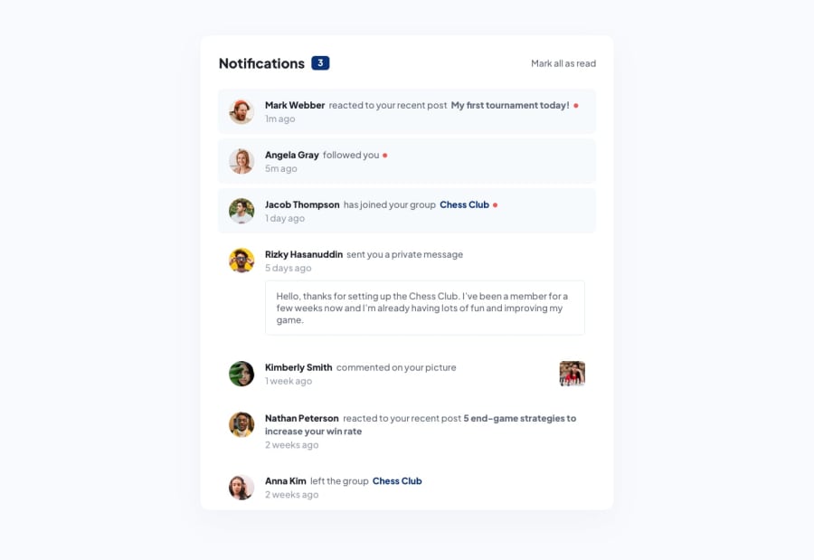
React notification list with styled-component
Design comparison
Solution retrospective
Could my code get any cleaner? I organized in three main components, but to my mind there might be some room for improvement.
Community feedback
- @festsnusaPosted almost 2 years ago
Hi there! Congratulations for completing this challenge.
I'm not quite sure if implementing React was necessary, because your styling component written in JS is kinda huge. You could minimize it using mixins in sass.
Also, I've noticed that:
- the whole item is unclickable. I guess if you click on an item, notification counter should decrease by 1 and an item itself should change its color;
- when you cllick on "mark as read", notification counter should be invisible;
- perhaps profile pictures and photo with chess should act as if there are links.
Hope you find my feedback useful. Happy coding.
Marked as helpful1@vinycius-pereiraPosted almost 2 years ago@festsnusa Hi!
Thanks for your feedback, I really appreciate it!
I chose react as an instinct, but as you sometimes it might not be necessary. I have re-worked some issues you pointed (if you wanna check it out :P).
What do you mean when you say pictures and images should act as links? I couldn't get that one.
Thanks again, have a good!
0
Please log in to post a comment
Log in with GitHubJoin our Discord community
Join thousands of Frontend Mentor community members taking the challenges, sharing resources, helping each other, and chatting about all things front-end!
Join our Discord
