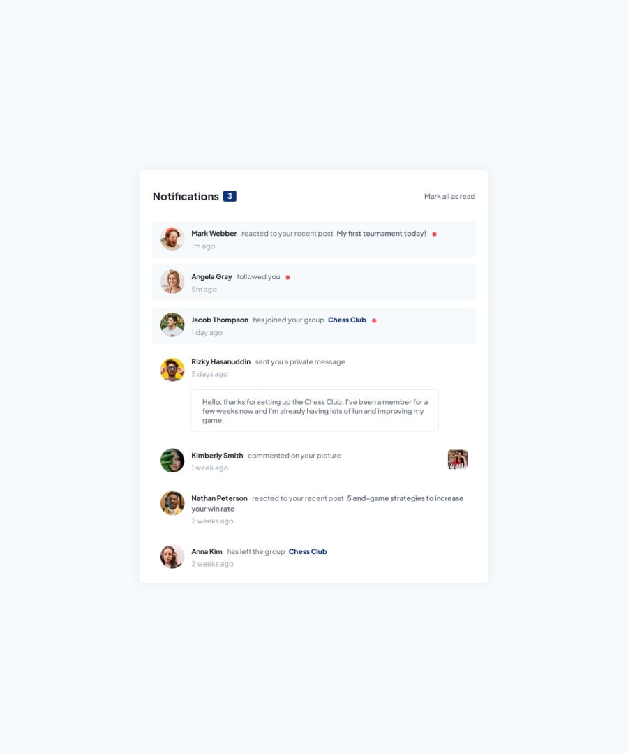


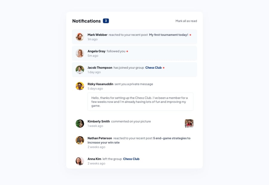
Design comparison
Community feedback
- @khatri2002Posted 3 months ago
Hi! The developed solution looks good! Just need to take care of the responsiveness of the webpage.
For the mobile resolution (width: 375px), the
messagediv is getting overflowed, causing the notification box not to take the full width, even thoughwidth: 100%is associated. To fix this, consider reducing the width of themessagediv for smaller resolution devices.Additionally, the text is getting overflowed within the message box due to a fixed height. I don't think a fixed height is necessary here. Instead of using a fixed height, consider providing padding to create space on the top and bottom. This will help resolve the issue of overflow text for smaller resolutions. If needed, the padding can be adjusted for smaller devices.
Keep up the good work! Happy Coding! 🚀
Marked as helpful0@manarboooPosted 3 months ago@khatri2002 Hey , thank you so much for taking the time to give me this feedback i totally appriciate it and will take it in consideration .
1

Please log in to post a comment
Log in with GitHubJoin our Discord community
Join thousands of Frontend Mentor community members taking the challenges, sharing resources, helping each other, and chatting about all things front-end!
Join our Discord