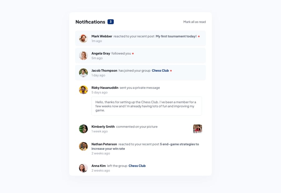
Design comparison
Solution retrospective
The use of tailwind css
What challenges did you encounter, and how did you overcome them?tailwind css installation
What specific areas of your project would you like help with?nothing for now
Community feedback
- @krushnasinnarkarPosted 4 months ago
Hi @Thirty-2,
Congratulations on successfully completing the challenge!
Your solution looks nice, though there are a couple of things you can improve, which I hope will be helpful:
-
Width Classes: You're using too many width classes for the
#Container. It's still occupying too much width on desktop screens. Simplify it by just usingmax-w-2xlTailwind class instead of all these classes:w-fit sm:w-fit md:w-fit lg:w-fit xl:w-fit. This will ensure the container has a maximum width and remains responsive. -
Background Color: Add a background color to the body to enhance the visual appeal and match the design specifications.
I hope you find this helpful.Feel free to reach out if you have more questions or need further assistance.
Happy coding!
Marked as helpful0 -
Please log in to post a comment
Log in with GitHubJoin our Discord community
Join thousands of Frontend Mentor community members taking the challenges, sharing resources, helping each other, and chatting about all things front-end!
Join our Discord
