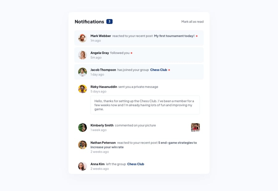
Design comparison
Solution retrospective
First time using Tailwind - I enjoyed it. Need to optimise it by adding some layers (or using React) as this involved a great deal of copying or pasting
Community feedback
- @AutumnsCodePosted 10 months ago
HI there,
your solution looks great. There is a few more thing I am suggestion to improve the code
I am not sure, if the design file say it, but I think the cursor pointer is missing when hovering over the section. Ans I think a little more margin-top and margin-bottom missing to make it more px-perfect
Marked as helpful0
Please log in to post a comment
Log in with GitHubJoin our Discord community
Join thousands of Frontend Mentor community members taking the challenges, sharing resources, helping each other, and chatting about all things front-end!
Join our Discord
