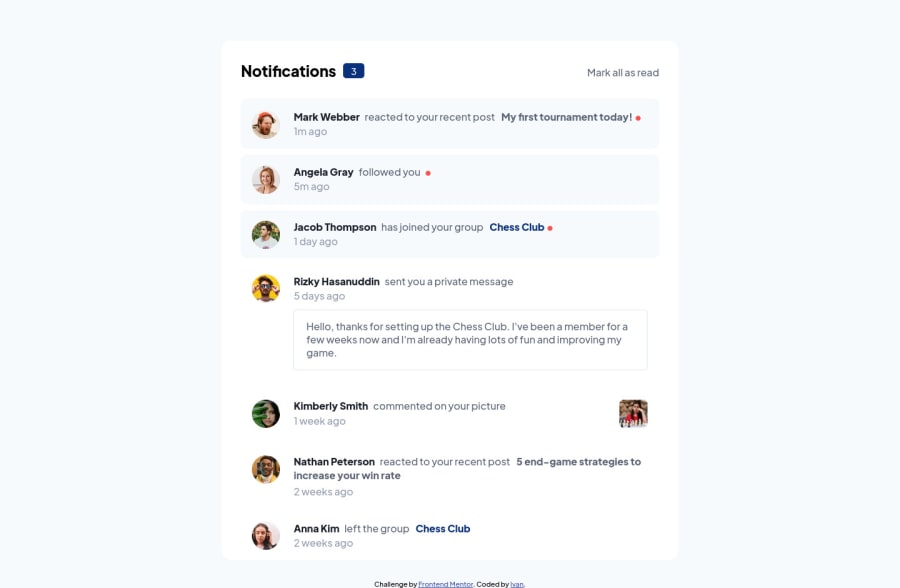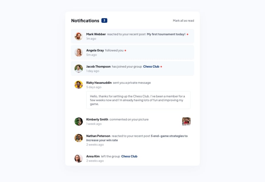
Design comparison
SolutionDesign
Solution retrospective
Any improvements are welcome!
Community feedback
- @antonADevPosted about 2 years ago
Your work is very impressive. Just some minor UI differences but still a very good job. The thing I can suggest is that <main> and <header> are intended to be at the same level of hierarchy in the page (one level below <body> ). Nesting one inside the other would therefore not be recommended. But overall, very impressive. Good job :)
Marked as helpful1
Please log in to post a comment
Log in with GitHubJoin our Discord community
Join thousands of Frontend Mentor community members taking the challenges, sharing resources, helping each other, and chatting about all things front-end!
Join our Discord
