Design comparison
SolutionDesign
Solution retrospective
There were no problems with this project, everything came easily and it just took time to polish it. In my opinion, the task should have been complicated by adding more interactivity.
Community feedback
- @for-dev9Posted almost 2 years ago
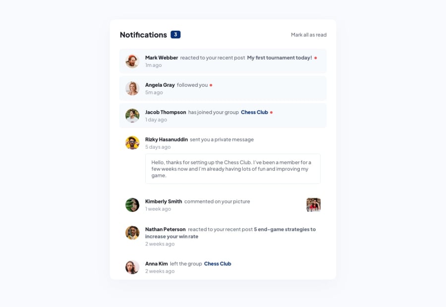
Hi, Nice work But i think u miss something. when click 'mark all as read' background color & Dot should disappear.
Marked as helpful0@vilnislvPosted almost 2 years ago@for-dev9
Hi. Thank you. I thought so too, but this task doesn't provide for it.
0
Please log in to post a comment
Log in with GitHubJoin our Discord community
Join thousands of Frontend Mentor community members taking the challenges, sharing resources, helping each other, and chatting about all things front-end!
Join our Discord
