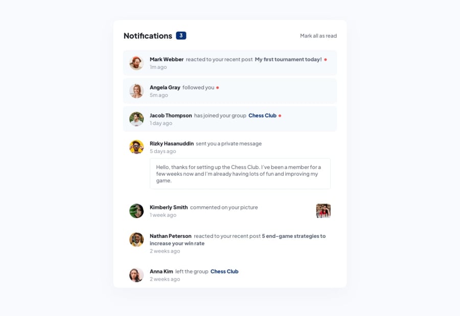
Design comparison
Solution retrospective
Hello Frontend Mentor Community!
Here is my solution to the the Notifications Page Challenge.
If any, are there any ways to improve my approach to this challenge?
What are the best practices when writing JavaScript Code?
I've noticed my CSS is getting longer and was wondering what are your advice in terms of organization of CSS?
Community feedback
- @ApplePieGiraffePosted almost 2 years ago
Greetings, Trung Lam! 👋
Nice work on this challenge! 🙌 Your solution looks great! 👏
About organizing your CSS—I'd suggest perhaps looking into using a preprocessor such as Sass. It'll add superpowers to your CSS (through features like nesting and functions) which will help reduce the number of styles you have and make writing and organizing CSS a little easier (or much easier for large projects).
Another small tip: it would be nice to add some padding to the
bodyor main container so that there is still a bit of space between the top and bottom of the card and the edges of the screen (even when the height of the viewport decreases). 😉Hope this helps. 😊
Keep coding (and happy coding, too)! 😁
Marked as helpful1
Please log in to post a comment
Log in with GitHubJoin our Discord community
Join thousands of Frontend Mentor community members taking the challenges, sharing resources, helping each other, and chatting about all things front-end!
Join our Discord
