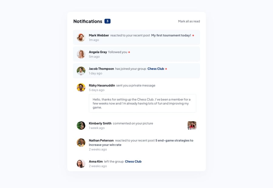
Design comparison
Solution retrospective
Hey everyone, This is my attempt at the notifications page! Found the HTML + CSS relatively easy but struggled with the JS. I eventually figured out a way to update the notification count in a simple and quick way (despite initially having over 30 lines of code with my first attempt!). At first I couldn't get the notification count to reflect the total number of notifications (JS newbie here) that had been marked as read (after user clicks) and would always find the notification count reflecting the amount of clicks, not the number of unread notifications. It was frustrating to say the least peering back at the code and not knowing what to do but I think I have found a decent enough solution! Please let me know how I can make it better!
Things I think I have implemented:
- 100% Mobile layout
- 75% Desktop layout
- 100% JS for notifications
Things I haven't been able to implement:
- Little red dot at the end of each notification (in both HTML/CSS & JS)
- Adjusting notifications to reflect desktop viewport
- Notifications in desktop layout which render content properly
Please share your feedback, suggestions, comments! Thanks :)
Community feedback
Please log in to post a comment
Log in with GitHubJoin our Discord community
Join thousands of Frontend Mentor community members taking the challenges, sharing resources, helping each other, and chatting about all things front-end!
Join our Discord
