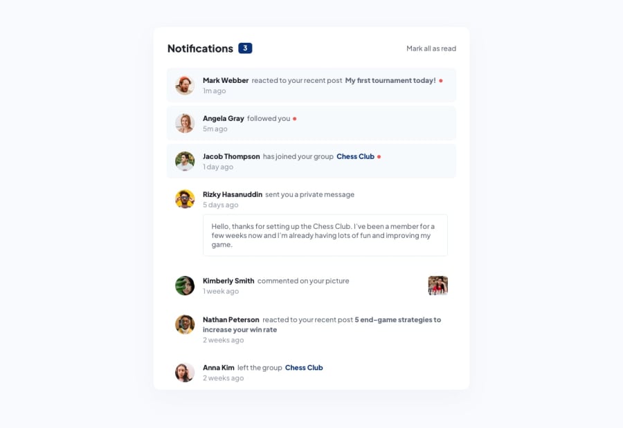
Design comparison
SolutionDesign
Community feedback
- @aashabulPosted almost 2 years ago
- Try to focus on details of the given designs. You will face more challenges If you try to replicate the design exactly and It will help you so much.
- your site is not mobile responsive properly. The red dots overlaps your texts.
- Before writing the HTML structure first, plan the components part by part and then you can visualize the whole document.
Marked as helpful0@shinaeliPosted almost 2 years ago@aashabul Can I get a visual demonstration of what you just told me? I will like to see how to go about something like that via a video. Thanks.
0@aashabulPosted almost 2 years ago@shinaeli Sure. Inform me when you want to start video meeting.
Marked as helpful0@shinaeliPosted almost 2 years ago@aashabul Sure, I will once I'm done with the project which I'm working on at the moment. Thanks so much. I really appreciate it.
0@aashabulPosted almost 2 years ago@shinaeli Thank you too. We can help each other. Happy coding!
Marked as helpful0
Please log in to post a comment
Log in with GitHubJoin our Discord community
Join thousands of Frontend Mentor community members taking the challenges, sharing resources, helping each other, and chatting about all things front-end!
Join our Discord
