Design comparison
SolutionDesign
Solution retrospective
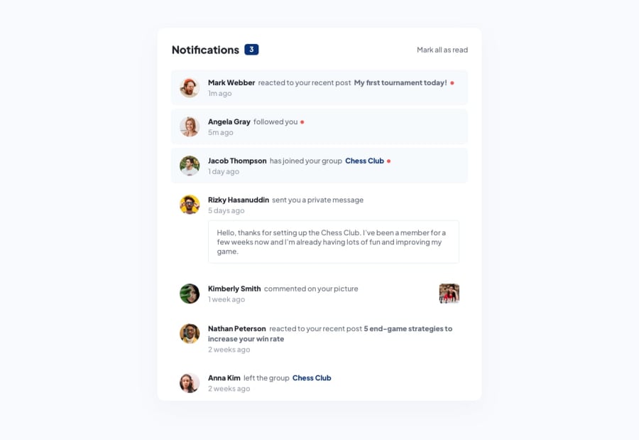
What i found difficult about this project was how to make sure text wraps properly onto the next line while I have the text in different divs. For example, the user name for each notification would be in its own div for certain styling, the action the user does and then the group or post type would all be separated into their different containers. This then makes it difficult for the text to wrap when using flexbox. I used inline display and vertical aligning to solve the issue.
Community feedback
Please log in to post a comment
Log in with GitHubJoin our Discord community
Join thousands of Frontend Mentor community members taking the challenges, sharing resources, helping each other, and chatting about all things front-end!
Join our Discord
