SASS, Grid, FlexBox, JS, Parcel
Design comparison
Solution retrospective
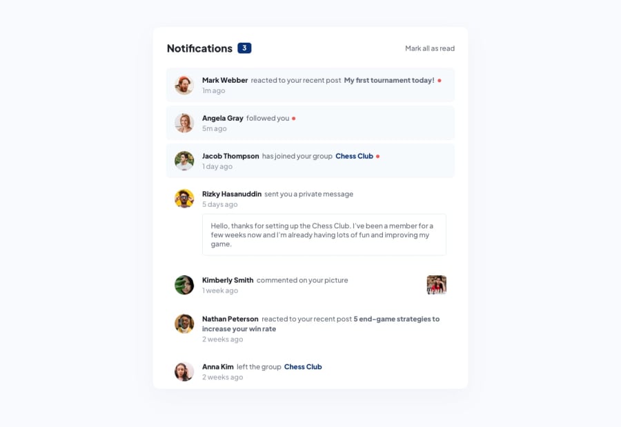
Well, one hell of a battle for me. I had overflow on my grid and "minmax" and other options which I tried didn't work. The chess picture was tricky as well. The solution is close to design just because I've used many too many @media queries. I hope to read some of your ideas and feedback. Feel free to point out all of my mistakes and downfalls. Maby it won't hurt me that much :) I used Sass for the first time and I love it. But deployment using Parcel for the first time was heartbreaking. It took a few days to solve the issue. My 'senior' friend helped me. Big Thanks to (https://pawelgrzybek.com/). This guy is an Alien. Follow him and you won't get lost. In JS I've used forEach() and for loop to practice two different ways. Happy New Year !!!!
Community feedback
Please log in to post a comment
Log in with GitHubJoin our Discord community
Join thousands of Frontend Mentor community members taking the challenges, sharing resources, helping each other, and chatting about all things front-end!
Join our Discord
