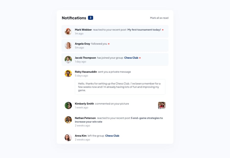
Design comparison
Solution retrospective
First project with react. I am still familiarizing with the ecosystem. Please do tell the best practices and things that could be improved upon. Thank you.
Community feedback
- @catherineisonlinePosted almost 2 years ago
Looks good, though need to make the notif-menu div a bit longer for mobile because it's too small and doesn't fit the content inside it, and wrap everything in the main tag instead of div to get rid of report issues. 😊
Marked as helpful1@gautamjuyalPosted almost 2 years ago@catherineisonline thank you. I WILL improve upon that.
0 - @gregoriofrancisco99Posted almost 2 years ago
Hey, pal. Congrats on the submission.
Your solution is very impressing nevertheless, there are some points I think you should try to improve.
-
HTML Semantic: instead of using div for 'everything' - which doesn't mean to much to the browser - you should try to use more meaningful tags. Don't hesitate on Googling you don't know them. 😄
-
The
<strong>is not meant to make the word bold just for visualization purposes. Click HERE to get to know him better -
The
altproperty in the<img>plays a big role when, for some reason, the image cannot load, without mentioning that people with disabilities rely completely on it to know what is the image content. So you should try to make it the more explanatory as possible. -
To create the red dot on the unread notifications, saw that you used a span with a dot on it. For this purpose I'd use a pseudo element. You can learn more about it here
Hope I was able to help! And remember Keep coding... 💻
Marked as helpful0@gautamjuyalPosted almost 2 years ago@gregoriofrancisco99 thank you. I will keep that in mind.
1 -
Please log in to post a comment
Log in with GitHubJoin our Discord community
Join thousands of Frontend Mentor community members taking the challenges, sharing resources, helping each other, and chatting about all things front-end!
Join our Discord
