Design comparison
Solution retrospective
All feedback is welcome
Community feedback
- @visualdennissPosted over 1 year ago
Hello Carmen,
great job with the challenge! Your solution looks good overall.
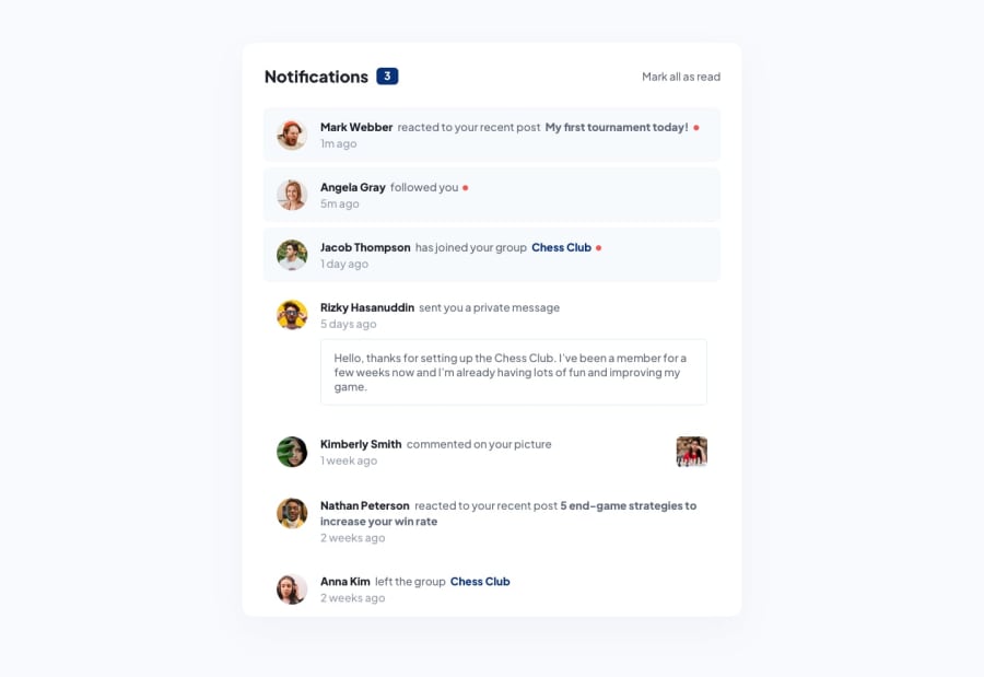
The notification container seems to be too close to the top of the screen, so i'd suggest simply adding min-height: 100vh; to the body, so the body covers entire screen height and it ll automatically center on the page since u already use flexbox for that.
Additionally, you can try to make it so that when users click on the unread notifications, they are updated/marked as read and so the counter changes as well. Optional but, perhaps when the count is 0, maybe no need to explicitly write zero, but only displaying count when there is at least one unread would make more sense.
Hope you find this feedback helpful!
Marked as helpful0
Please log in to post a comment
Log in with GitHubJoin our Discord community
Join thousands of Frontend Mentor community members taking the challenges, sharing resources, helping each other, and chatting about all things front-end!
Join our Discord
