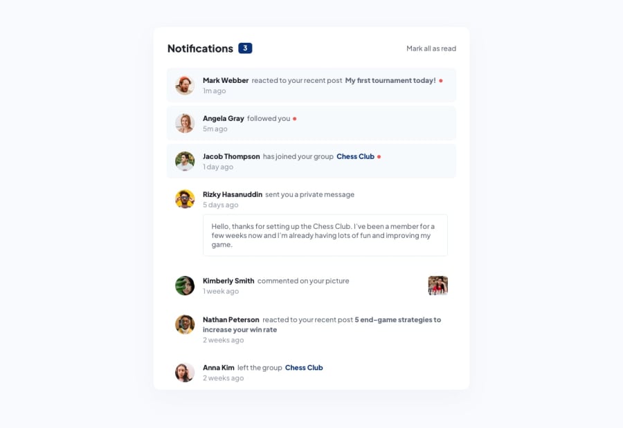
Design comparison
Community feedback
- @danielemanca1983Posted almost 2 years ago
Hi Musa, hope you're doing well.
Please allow me to provide you with some constructive feedback, your solution is pretty good, however I believe in terms of mark-up, it can be improved a tad.
-
The challenge, based on the design, does not absolutely require an H1, however I'd suggest to perhaps use one on the Notifications text, because frontendmentor does require to have an H1 on each submitted challenge, this is also to get folks used to apply as much semantic mark-up as possible and get developers used to implement accessibility into their work.
-
Same goes for the images, all images on the web require a descriptive alt attribute to enable screen readers access the image description for people with certain visual impairments, including blindness on different levels.
The CSS and Jquery code are pretty good, well done overall.
Marked as helpful1 -
Please log in to post a comment
Log in with GitHubJoin our Discord community
Join thousands of Frontend Mentor community members taking the challenges, sharing resources, helping each other, and chatting about all things front-end!
Join our Discord
