Responsive & Interactive Notifications page | Tailwind | Vite


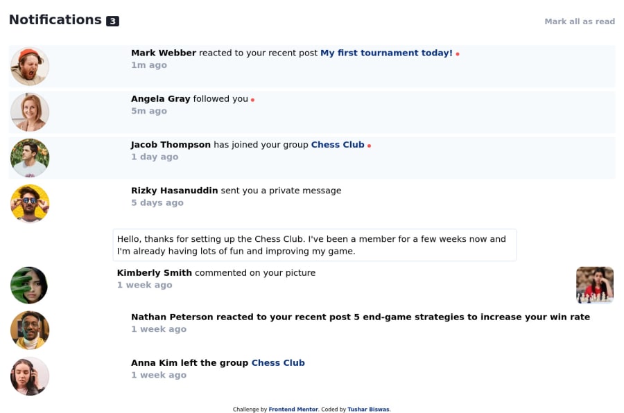
Design comparison
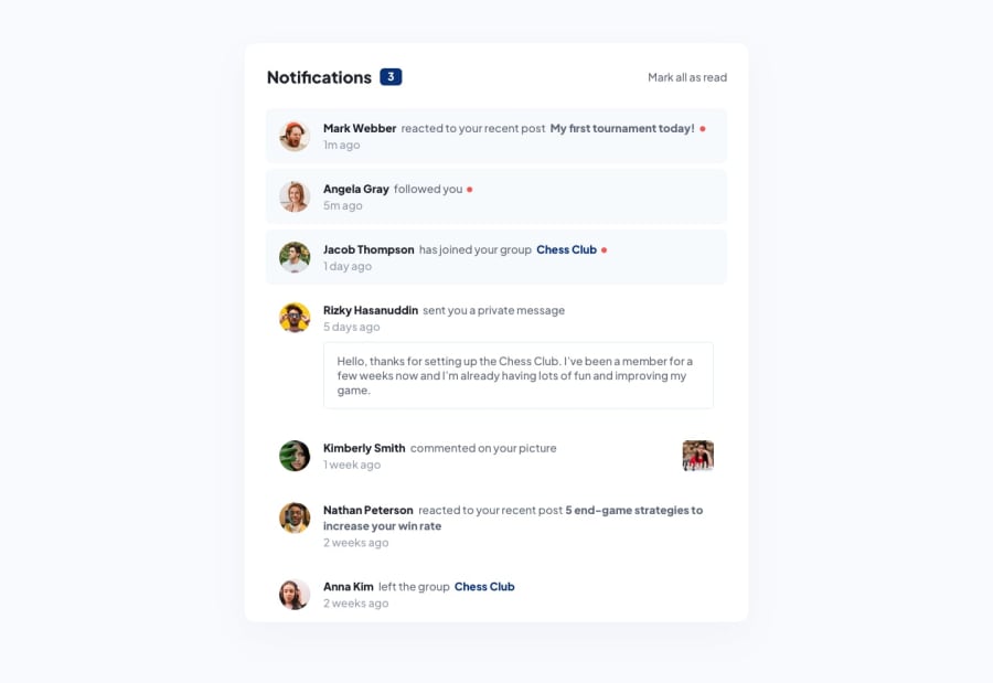
Solution retrospective
Hello Developers👋
Another nice project to practice DOM manipulation with toggle visual state and I enjoyed building it 😄
As always, I'd really appreciate if you could answer the following:👇
1.What did I do wrong? 2.What did I do right? 3.How can I improve? common mistakes?
🙏Thanks in advance Happy Coding😄
Community feedback
- @naomi-phamPosted over 2 years ago
Hi Tusher, great job with using Tailwind and vanilla JavaScript for your project. I think your Tailwind code is very concise and easy to read. I also learned about the Tailwind's utility space-between
space-y-2from your code. It is amazing!!However, I noticed that you put some parts like
<section>Hello, thanks for setting up the Chess Club ...</section>in a separate paragraph; as a result, it does not appear in the same block of the parent. You can resolve this by wrapping it in the same div of the content besides the profile pic. This is also metioned by Igo in the 3rd point of his comment.Keep up the amazing work!
0@itushPosted over 2 years ago@naomi-pham Thank you very much for your feedback Naomi🙏. I'm glad to know that the Tailwind code was easy and readable to you. Feel free to revisit the code (I've made some changes) Tailwind's utility space-between is super cool, couldn't agree more. But you learned about it after checking out my code is even cooler😄 (it means a lot to me...) The private-message is now inside the same parent element along with its siblings.
Additionally users can now mark "individual notification as read".
Looking forward to receive more feedback from you in future. Happy Coding😄
1@naomi-phamPosted over 2 years ago@itush Hi Tushar, I just checked out your code and demo again. Love that you added the additional functionality of "marking individual notification as read". I have also completed this challenge a while ago with React & Tailwind. Will def give this a try too. 😆
So happy to meet other Tailwind enthusiasts here! I really look forward to reading more code from you in the future.
0 - @igomonteiroPosted over 2 years ago
Hi Tushar, good job!
Feedbacks about your solution.
1. What did I do wrong?
- The notifications counter background color is wrong, you need to use the primary blue color
- The "actions" text color needs to be more neutral, a opaque gray color. For example, in the text: "followed you"
- The last two notifications have the whole text as a link, but the links are only for the users name and the post/picture name
2. What did I do right?
- Nice job with the mark all as read
- The mobile view look's good
- Nice use of "section" semantical tag
- Good colors organization in the tailwind config file
- Nice job in the counter.js module file, next time, try to organize this file inside "utils" or "lib" folder, for example
3. How can I improve? Common mistakes?
- Try to use a wrapper around the whole notification component to center the component in the window, then set the background-color of the body to "Verylgb" and keep the notification component white
- You need to improve the paddings and margins
- Implement individual mark as read, e.g when clicking in the notification or in the red circle. Note: after implement this feature, add some condition that not allow the counter to be less than zero, I saw many users doing this mistake
- Wrap the "avatar" and the "content" in the same div, that will solve the "space-between", the space-between is throwing the avatar to the left side, away from the content, it is interesting when the content have the picture, like in the "Kimberly Smith" notification
- Improve the hover effect, see the "active state" picture in the design starter files, this will help you
- In my opinion, the most common mistake is: getting your hands dirty without stopping a little to think first, actually, this is a mistake that I make a lot. Before you start styling your HTML page with tailwind, first, stop a little and analyze the design you have to clone/reproduce, build the HTML from it WITHOUT any style first, just to organize the things, think about the parts you can organize in a container/wrapper , for example, "hmm, there is a main notification content here, but you can see that the avatar is next to this content, it is part of this content, it might be interesting if I organize them all inside a container, in addition, the notification paragraph and its timestamp are vertically aligned, maybe organizing them inside another div is also interesting, so I can use a flex with column direction
I hope you understand, english is not my native language, but I'm trying haha
Keep it up, one step at a time, good job! 🚀
0@itushPosted over 2 years ago@igomonteiro Thank you very much for your feedback Igo 🙏.
- The notifications counter background color is now Blue.
- I'm not sure how you want to modify the "actions" text color.
- Actually in the last two notifications, only the user names and post(s) have anchor tag and not the whole text. An anchor tag was missing for "5 end-game strategies to increase your win rate" which is now rectified.
- Made some other improvements (padding, margin, font-size etc.)
- " individual mark as read" is now implemented and the counter works correctly.
Looking forward to receive more feedback from you in future. Happy Coding😄
1


Please log in to post a comment
Log in with GitHubJoin our Discord community
Join thousands of Frontend Mentor community members taking the challenges, sharing resources, helping each other, and chatting about all things front-end!
Join our Discord