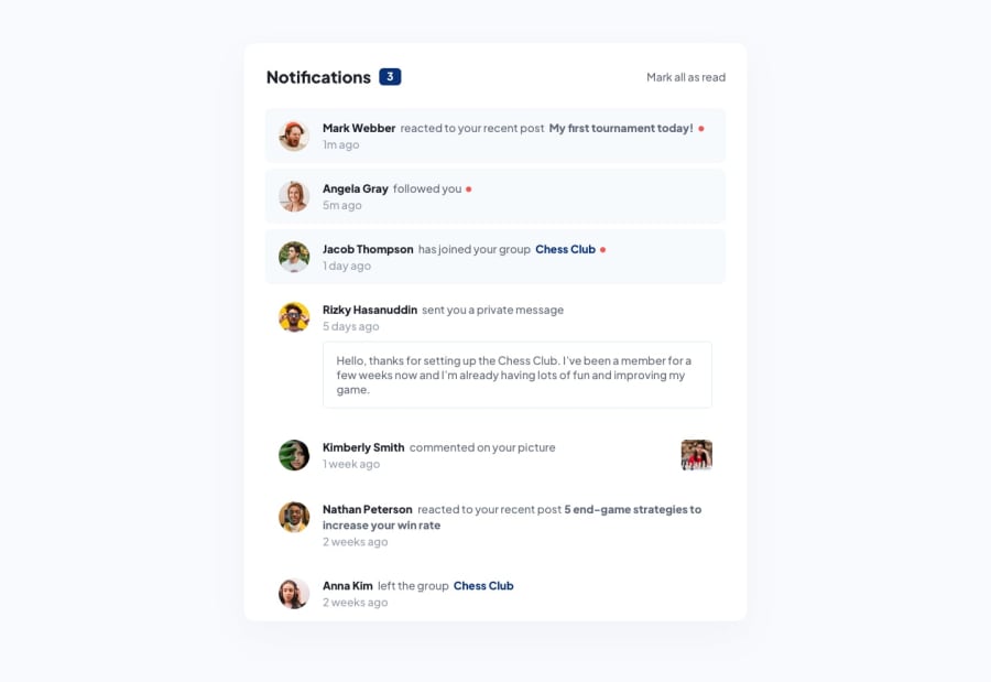
Design comparison
Solution retrospective
Hi!
It's my approach to the challenge.
I don't know much about JS but I've managed to make my code work, but I'm aware that it is not hight quality code. Not really sure how to make it more preety.
I have a problem with positioning of dates under the nottification. It looks the same as in design only when there are two lines of text in notification. When there is only one, the space beetwen date and notification is too big.
I also have a problem with .webp files. On my live serwer there is everything ok. However when I'm opening the site on github server I see no images on it. When I'm checking in the console it says that the files were not found (404).
Does anyone know how to solve this problem?
I'll be very grateful for every help.
Community feedback
- @ApplePieGiraffePosted almost 2 years ago
Hey, sztosiur! 👋
Well done on this challenge! 👍
In order for the images to show up in your solution, you need to use relative (not absolute) paths to your images. In this case, adding a
..before the path should work (as in,../assets/etc.). 😉Also, I'd like to suggest using more semantic HTML elements in your markup (rather
divs for many things), which is important for accessibility and SEO-related reasons. For example, you can useimgelements for the avatars in each notification and theulandlitags to wrap the notifications (since they are a list of notifications). If you’d like to learn more about how to write semantic HTML and why it matters, you can check out this short, helpful course on the subject.Hope you find this helpful. 😊
Keep coding (and happy coding, too)! 😁
Marked as helpful0@sztosiurPosted almost 2 years ago@ApplePieGiraffe the path tip worked, thanks! :)
I will check the course that you recomended me, thank you!
1
Please log in to post a comment
Log in with GitHubJoin our Discord community
Join thousands of Frontend Mentor community members taking the challenges, sharing resources, helping each other, and chatting about all things front-end!
Join our Discord
