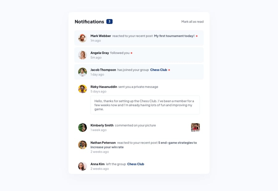
Design comparison
SolutionDesign
Solution retrospective
Hello, I have finished this exercise!
I've had to add justify-content: flex-start; for @media(max-width: 40rem) so that the container is centred properly. Without it, the container nudges above and some part of it can't be seen. Is there a better practice around it?
I've used forEach on Javascript to mark every notification as read, though I wonder if there's a better way to do it.
Thank you for reading, any feedback is appreciated!
Community feedback
Please log in to post a comment
Log in with GitHubJoin our Discord community
Join thousands of Frontend Mentor community members taking the challenges, sharing resources, helping each other, and chatting about all things front-end!
Join our Discord
