Design comparison
SolutionDesign
Community feedback
- @Pulkit-s21Posted about 2 years ago
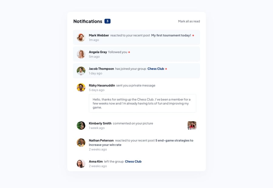
@Mmezirim I saw your site and it has issues. The notifications which aren't new dont have the blue background. When we click on mark all as read it should mark all notifications as read meaning removing the background and the red dot next to them and as a bonus you can make the notification bubble with 3 as its text to 0 to show no messages are left to read. Easy and quick changes to implement to finish the challenge perfectly
0
Please log in to post a comment
Log in with GitHubJoin our Discord community
Join thousands of Frontend Mentor community members taking the challenges, sharing resources, helping each other, and chatting about all things front-end!
Join our Discord
