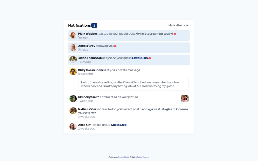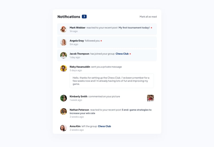
Notifications main page using HTML, CSS and JS
Design comparison
Solution retrospective
I want to know how to properly structure a CSS stylesheet, I'm sure I commited a lot of mistakes in that part of the challenge.
Community feedback
- @AdamMzkrPosted over 2 years ago
good solution, but i think its to low padding in all messages if you add some padding will look so better:)
Marked as helpful0 - @SatellitePeacePosted over 2 years ago
Hello @rodriwa congrats on completing this challenge as for your question
-
You did a pretty good job in your case but here are two things that you might want to work on
-
It is better to place you media queries at the bottom of other styles because you only use the media queries to adjust certain styles to fit certain screen sizes, so placing it first can cause a bit of confusion to the person reading the code
-
try learning and using BEM style to name you classes BEM makes it easier for you to give your classes a decriptive name which will in turn make it easier for others to read and understand your css without having to read your html multiple times to know what certain classes are for
-
Lastly try using Html semantic element s like main, nav and section
I hope this helps
Marked as helpful0 -
Please log in to post a comment
Log in with GitHubJoin our Discord community
Join thousands of Frontend Mentor community members taking the challenges, sharing resources, helping each other, and chatting about all things front-end!
Join our Discord
