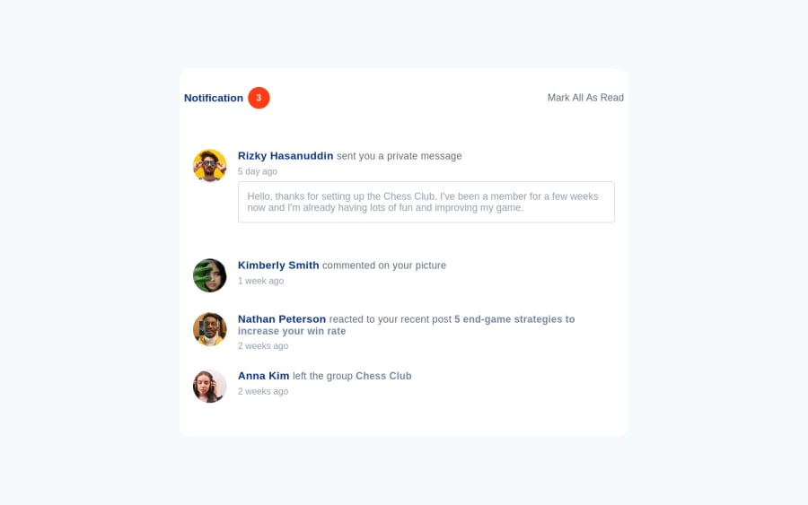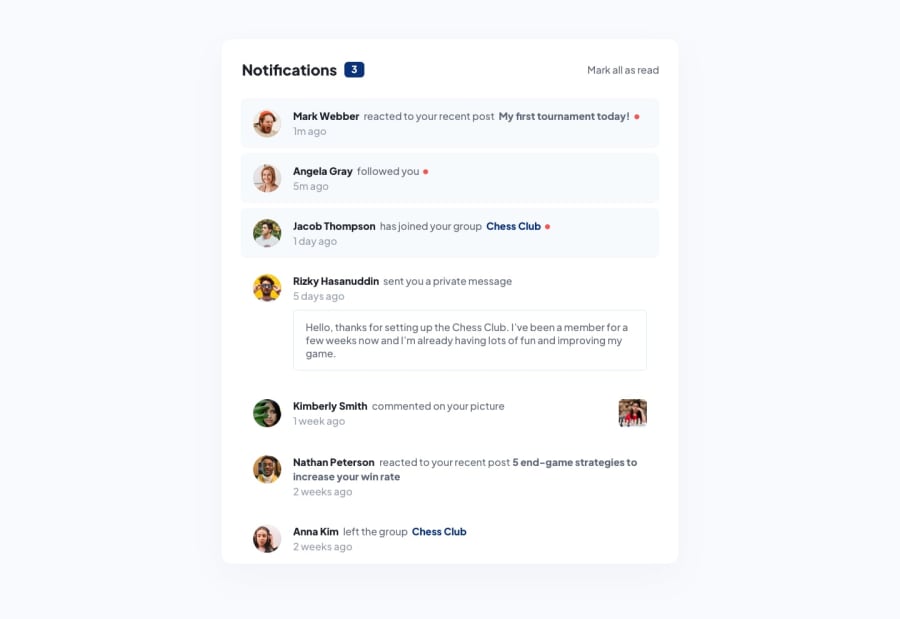
Design comparison
SolutionDesign
Solution retrospective
Notification-page Completed, How is it ?
Community feedback
- @antonADevPosted about 2 years ago
Hi Mohaimin... First of all congratulations for finishing the challenge 🎉. The overall work is not bad, but there are some issues:
- First and foremost, the <main> element represents the dominant content of the <body>, so it should not be a child element of any other element, exept of the <body> element.
- The use of the generic <section> element represents a generic standalone section of a document, which doesn't have a more specific semantic element to represent it. Sections should always have a heading. So I would refactor your code, removing all those sections, and put, for example, all the notifications in the <main> element.
As for the design, like I've already said, the overall work is not bad, but there are some parts missing:
- The unread notifications should be visible on the page load, and only become read on the click of the 'Mark all as read' button. It means that the style should become like the last four comments below, from an unread state to an read state, and not invisible at all.
- The counter near the Notification header should react on the click and become 0.
- The commented picture figure is missing in the 'commented on your picture' notification.
Hope my answer will help you to improve your skills and keep coding 😊
0@CodeWithMohaiminPosted about 2 years ago@antonADev great comment, Thanks for comment. Take love. I will try to more semantic my codes and completed
0
Please log in to post a comment
Log in with GitHubJoin our Discord community
Join thousands of Frontend Mentor community members taking the challenges, sharing resources, helping each other, and chatting about all things front-end!
Join our Discord
