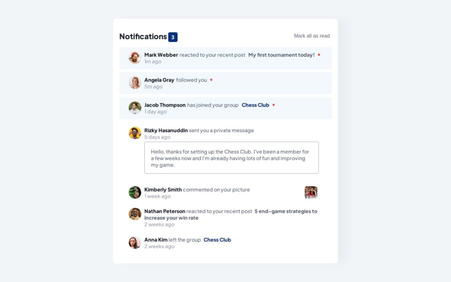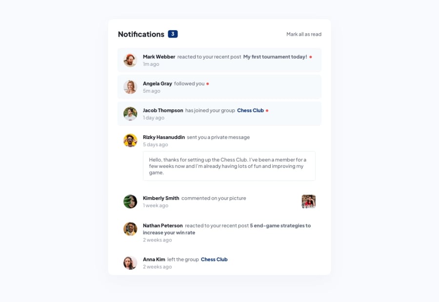
Design comparison
SolutionDesign
Solution retrospective
Well,
with this project I had some issues with my responsive design. On mobile is not showing the red dots properly. I've tried several ways and I couldn't find a solution.
So if you can help me with that, I will appreciate it ;)
Please log in to post a comment
Log in with GitHubCommunity feedback
No feedback yet. Be the first to give feedback on Elyticus's solution.
Join our Discord community
Join thousands of Frontend Mentor community members taking the challenges, sharing resources, helping each other, and chatting about all things front-end!
Join our Discord
