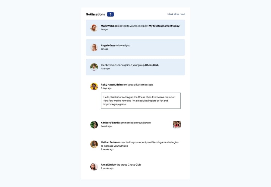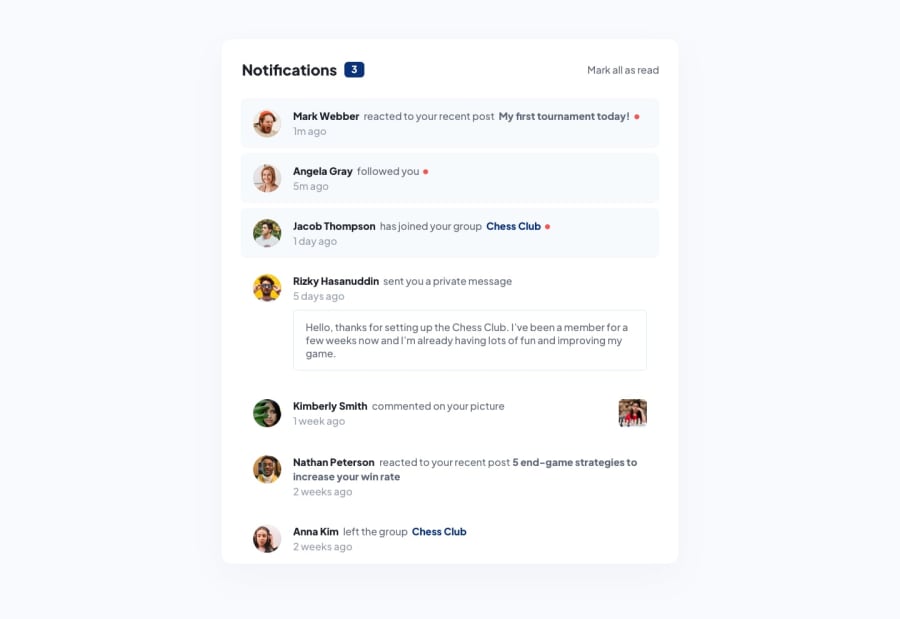
Design comparison
SolutionDesign
Solution retrospective
Hi there 👋, This is my solution for this challenge.
📑 Features:-
- Achieved 100% score for Accessibility, SEO & Performance and 95% score for Best Practices in Desktop Lighthouse. 📊
- Achieved 100% score for Accessibility & SEO and 99% score for performance and 95% score for Best Practices in Mobile Lighthouse. 📊
- Styling implemented using Tailwind CSS 🎨
- Simple Transition-color while hovering on button & texts. 🎬
- FlexBox 📦 Code formatted using Prettier 💻
I'll appreciate any suggestions & feedback on how to make red dot beside the line text even when getting down .
Thank you. ✌️
Community feedback
Please log in to post a comment
Log in with GitHubJoin our Discord community
Join thousands of Frontend Mentor community members taking the challenges, sharing resources, helping each other, and chatting about all things front-end!
Join our Discord
