Design comparison
Solution retrospective
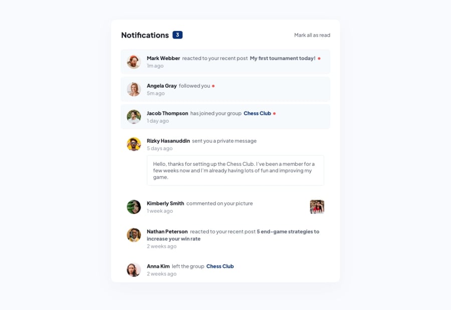
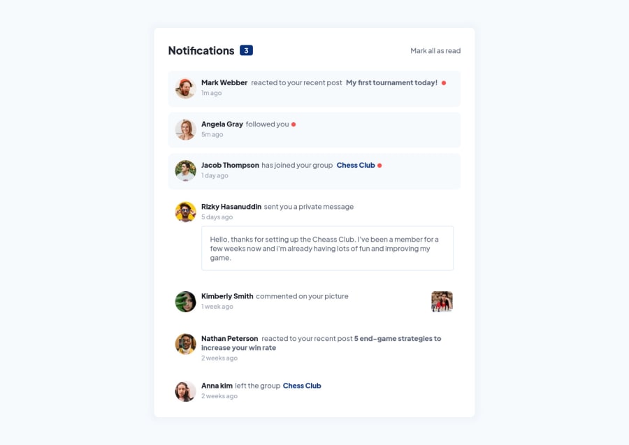
I have one doubt regarding how the frontend mentor wants us to design the desktop version, do they expect the required design to be within the 100vh of the desktop. I don't have premium(so i don't the figma files). If so, how can archeive that? The design will be too small to be used in desktop right?
Community feedback
- @john-miragePosted about 2 years ago
Hello,
The desktop size used for the screenshot is 1440 / 800.
-
If your screen height is lower than the "card" height it should overflow and a scrollbar should appear on the screen to reach the bottom of the card.
-
If you screen height is higher than the "card" height, it should be displayed like the screenshot.
Note: Even if it seems that the card is vertically centered on the page, i don't think this is the case. Just add some vertical padding on the page and it's done.
Offcourse this is just my guessing, but it seems to be the best approach to me.
If you want an example of what i've just said, feel free to check out my solution for this project on my profile.
1 -
Please log in to post a comment
Log in with GitHubJoin our Discord community
Join thousands of Frontend Mentor community members taking the challenges, sharing resources, helping each other, and chatting about all things front-end!
Join our Discord