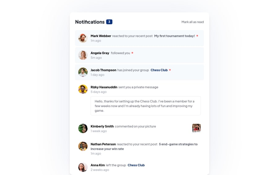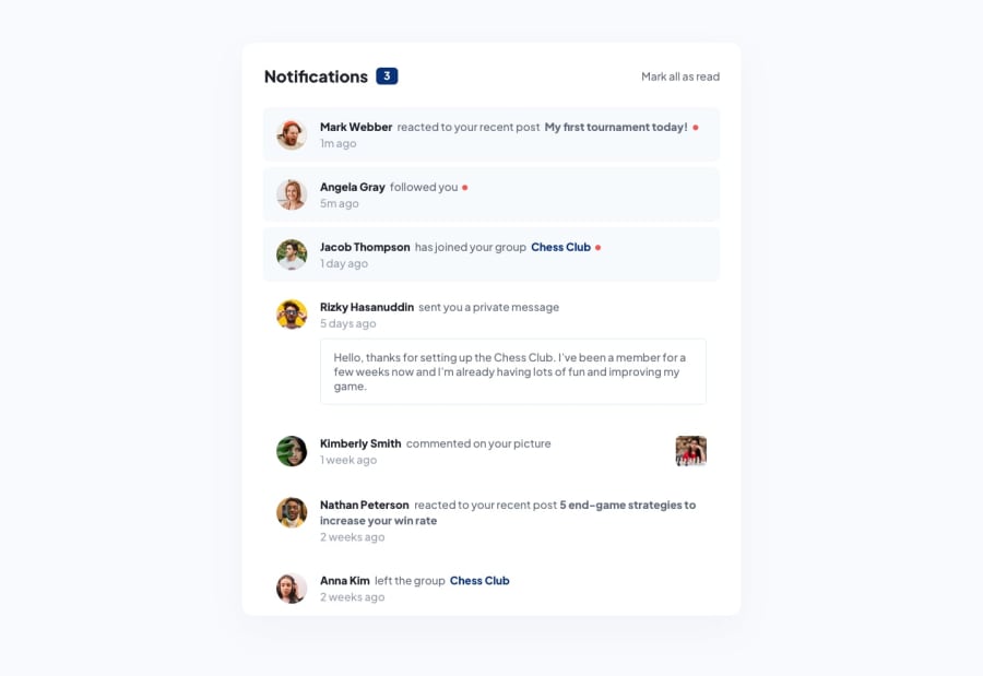
Notification Page with Pure HTML and Tailwindcss
Design comparison
Community feedback
- @starryrobotPosted over 2 years ago
Hey again, I checked and it looks really good! In my attempt I struggled with the red dot and laying out the individual notification items. I tried to look at your code but it's Tailwind CSS and not vanilla and so couldn't understand it. Any suggestions on how to implement the red dot and also, what layout method did you use for the items? Thanks and nice work!
0@rodevasiaPosted over 2 years ago@starryrobot I used the pseudo element
::afterto show the red dot. I added to theptag so it will align based on its position.0 - @starryrobotPosted over 2 years ago
Hey Robert, The live demo looks really good! It looks like you have a great attention to detail on the design front. Personally I would have liked to have seen this functioning with JS just because it's very well designed and would have been nice to have seen everything in action :)
Great work!
0@rodevasiaPosted over 2 years ago@starryrobot Thank you so much. I've added js functionality too. check it now
0
Please log in to post a comment
Log in with GitHubJoin our Discord community
Join thousands of Frontend Mentor community members taking the challenges, sharing resources, helping each other, and chatting about all things front-end!
Join our Discord
