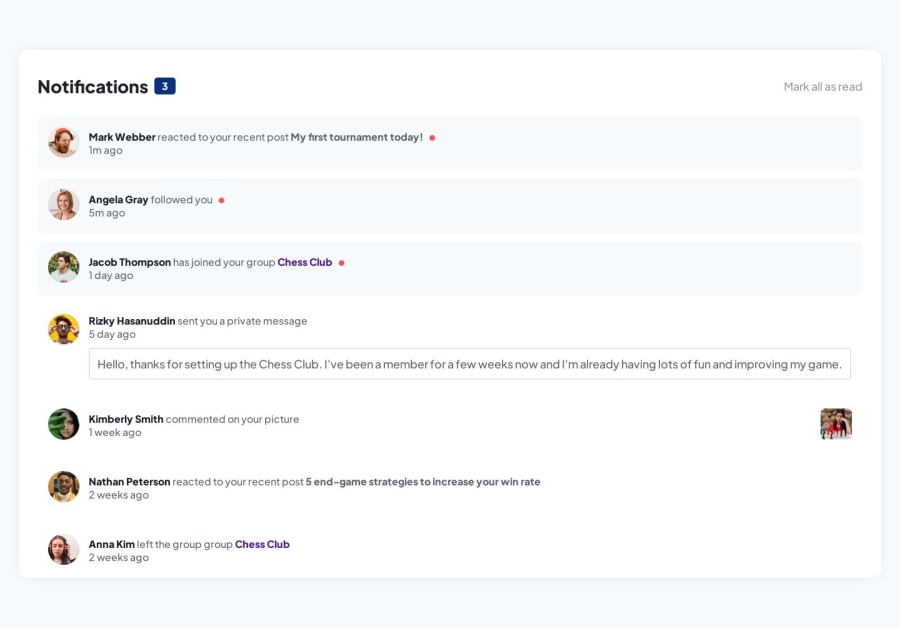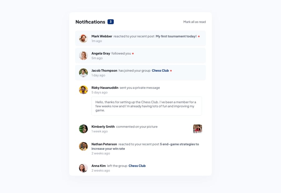
Design comparison
Please log in to post a comment
Log in with GitHubCommunity feedback
- @Philip-Droubi
Congratulation on completing this challenge.
Here are some tips you can do to improve your solution.
First for the page
bodyit's better to add this code.body { font-family: "Plus Jakarta Sans", sans-serif; background-color: hsl(210, 60%, 98%); font-size: 16px; color: hsl(219, 12%, 42%); min-height: 100vh; /* To take the full page height on all screens*/ display: flex; /* To center the main element */ align-items: center; justify-content: center; }For
mainor.containeryou need to delete the marginmargin: 80px auto;also delete it from the 600px media querymargin: 20px auto;Now for the
.wrapperI think by doing this it will look better :.wrapper { background-color: white; padding: 40px 30px 0; margin: 0 auto; max-width: 800px; /*So that the element does not appear too wide on the screen */ width: 92%; /*To fit small screens*/ max-height: 90vh; /* To be shorter than the height of the screen */ overflow-y: scroll; /* To show all elements in the wrapper */ border-radius: 15px; box-shadow: 0px 0px 26px -13px rgba(0, 0, 0, 0.26); }Also delete
margin: 10px;from.wrapper600px media query.If you don't like the default scrollbar, I recommend this :
.wrapper::-webkit-scrollbar {
    width: 8px;
    background: lightgray;
    border-radius: 10px;
}

.wrapper::-webkit-scrollbar-thumb {
    background: gray;
    border-radius: 8px;
}
Hope this helps you :)
Marked as helpful
Join our Discord community
Join thousands of Frontend Mentor community members taking the challenges, sharing resources, helping each other, and chatting about all things front-end!
Join our Discord
