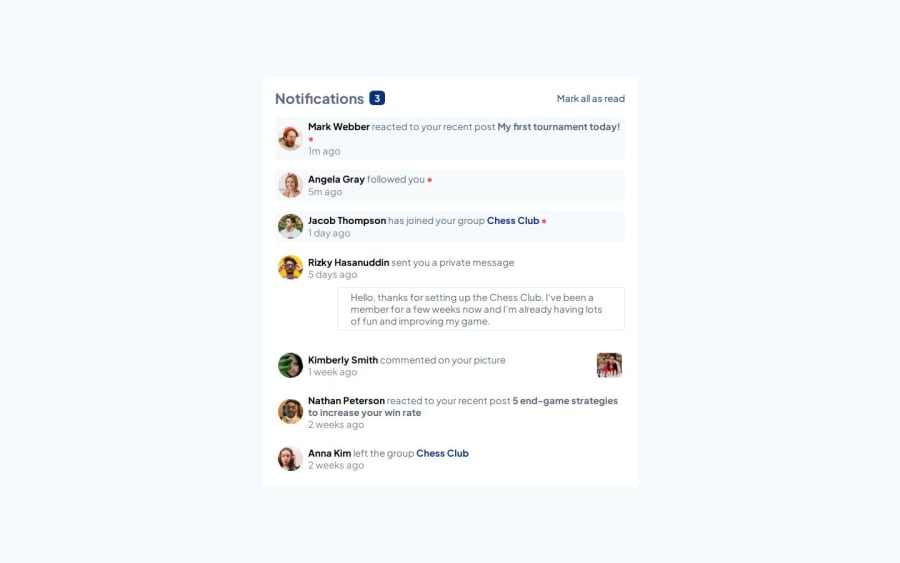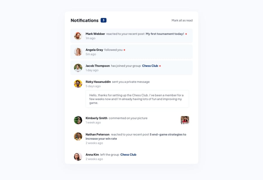
Design comparison
Solution retrospective
Im proud I was able to make this without any major layout issues. I'm starting to understand when and where to create divs now and when to use flex on them for spacing and organization.
What challenges did you encounter, and how did you overcome them?My main issue was finding out how to place the red dot i tried creating a div that just had a red BG with a border radius of 50% but it was messing up my layout badly. I tried using both grid and flex to no avail. Next i tried creating a paragraph with just a dot in it and changing the font size but that didn't look nice either. In the end I settled on a span with a character code and it turned out perfect.
What specific areas of your project would you like help with?Anything about my markup and if I overdid it with divs, if there is any cleaner or better way I could have written my markup.
Community feedback
Please log in to post a comment
Log in with GitHubJoin our Discord community
Join thousands of Frontend Mentor community members taking the challenges, sharing resources, helping each other, and chatting about all things front-end!
Join our Discord
