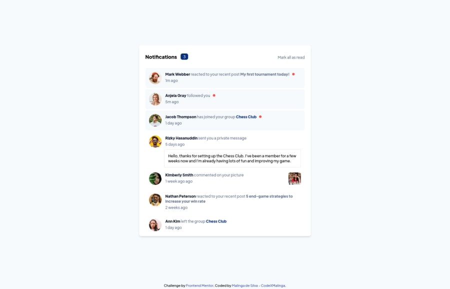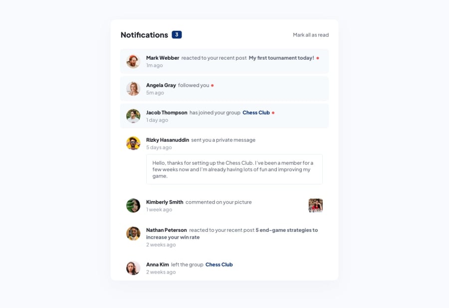
Design comparison
SolutionDesign
Community feedback
- @antonADevPosted about 2 years ago
Hi Malinga... First of all congratulations for finishing the challenge 🎉. No much to say to your work, very impressive.
Just some accessibility improvements:
- Generally, it is a best practice to ensure that the beginning of a page's main content starts with a h1 element, so I would suggest to wrap the “Notifications” inside the div, with an h1 element.
- Wrap the “attribution” div in a <footer> semantic element.
Remember, it’s best practice to structure your page with HTML5 reference elements (nav, header,main,footer…)
Hope my answer will help you to improve your skills and keep coding 😊
Marked as helpful1 - @CodeXMalingaPosted about 2 years ago
Thank you Anton for your review. I will remember your bits of advice and will include them in my future challenges. Happy Coding.
0
Please log in to post a comment
Log in with GitHubJoin our Discord community
Join thousands of Frontend Mentor community members taking the challenges, sharing resources, helping each other, and chatting about all things front-end!
Join our Discord
