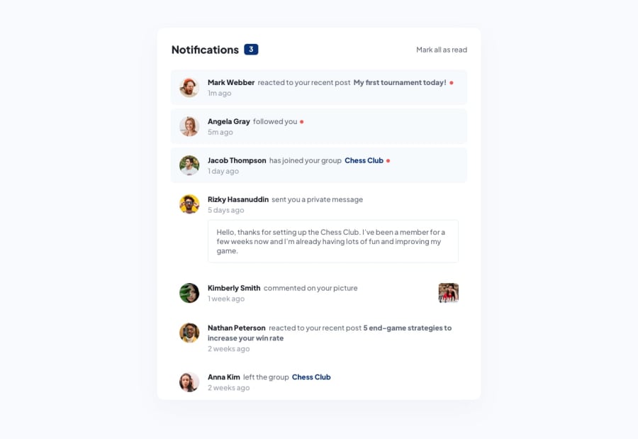
Design comparison
Solution retrospective
While this challenge may seem simple at first glance, I decided to give myself the challenge to use very minimal HTML and instead transfer the information to a JSON file and use mainly plain javascript to calculate the number of unread notifications and iterate through the different states and conditions, thus making this notification page a little more dynamic. The if/else block in the for loop as well as sequencing was a little tricky for me but I am glad everything worked out in the end.
While some of the steps may seem counter-intuitive e.g. time, in this case, is static, the main purpose of approaching this challenge this way is to build my foundation for building webpages and applications with APIs and backend technologies like node.js later.
Lastly, inspired by some of the developers on this platform, I decided to do a little redesign too.
Feel free to give any feedback.
Community feedback
- @visualdennissPosted over 1 year ago
Hey there,
This challenge is tricky, so congrats on completing it successfully!
Also great job in customizing the design! Very nice to see that you try to go beyond what's given. Looks pretty neat overall.
I'd suggest try to avoid using px for font-sizes and other stuff as well, instead use the responsive rem/em units. Here is a great resource on YT for clarifying all the differences between rem/em and explain why to use them: https://www.youtube.com/watch?v=dHbYcAncAgQ
The clickable, interactive elements like "Chess Club" should be a link instead of a span. Same for the author names as usually clicking on them redirects to their profile page etc.
The hover effect on "Mark all as read" seems a bit abrupt, i'd suggest keeping the font-weight same between states. You can add some transition as well like transition: all .4s ease;
Keep up the great work and customizations!
Hope you find this feedback helpful!
Marked as helpful1@Jo-cloud85Posted over 1 year ago@visualdenniss Thanks for the feedback! Ok! I will note using rem/em instead of px in my future challenges. Meanwhile, I modified the clickable elements to anchor tags and smoothen the hover effects as per your suggestions.
1 - @0xabdulkhaliqPosted over 1 year ago
Hello there 👋. Congratulations on successfully completing the challenge! 🎉
- I have other recommendations regarding your code that I believe will be of great interest to you.
JAVASCRIPT 🟡:
- The way you declared variables are need to be well structured and organized
- Take a look at the following example code which describes a better way of declaring variables to have a well structured code
const firstName = "Your"; const lastName = "Name"; const emailAddress = "[email protected]"; const password = "supersecret";- instead try this,
const firstName = "Your", lastName = "Name", emailAddress = "[email protected]" ••• ••• // n number of declarations password = "supersecret"; // make sure to add a semicolon at end of last declaration- This single line declaration with separated commas will helps you to have a better structured code and improves readability though
.
I hope you find this helpful 😄 Above all, the solution you submitted is great !
Happy coding!
Marked as helpful0@Jo-cloud85Posted over 1 year ago@0xAbdulKhalid I see! Thanks for sharing! I will keep that in mind. This indeed cuts down on the number of 'const' appearing which can be overwhelming.
0
Please log in to post a comment
Log in with GitHubJoin our Discord community
Join thousands of Frontend Mentor community members taking the challenges, sharing resources, helping each other, and chatting about all things front-end!
Join our Discord
