Notification Page Solution: Built with Semantic HTML, CSS and JS
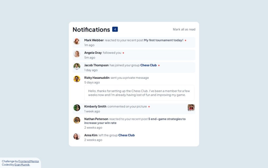
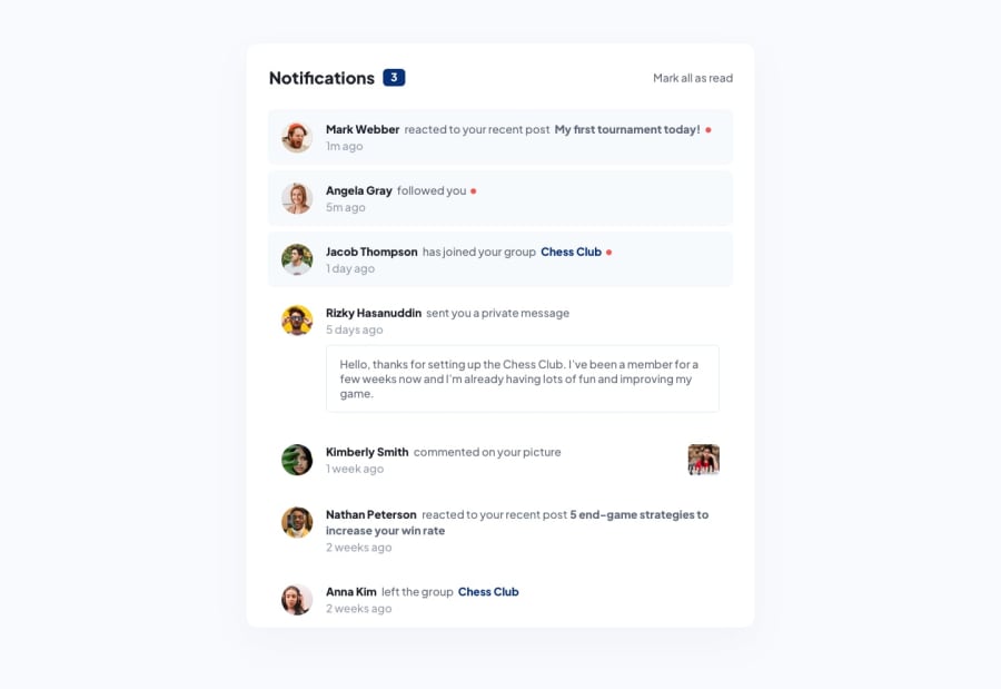
Design comparison
Solution retrospective
I thoroughly enjoyed the challenge and frustration that came with it. Overall, I am proud of my solution.
What I would do differently is spend a bit more time with attempting to determine the layout options of the website and components thereof. For example, I will think about using classes, particularly why and where it would be necessary. Utilising classes has improved my overall project solution, especially with JavaScript. Overall, I will continue to improve on all my skills but I particularly need to focus on JavaScript.
What challenges did you encounter, and how did you overcome them?My biggest challenge was the placement of the circle indicating a new notification. In the design solution, the circle was place on the right-hand side of the text notification, irrespective of the notification length. I solved this issue by using an HTML entity, the black circle, which I placed within a span tag. Thus, allowing the circle to display on the right-hand side of the notification text irrespective of the text length.
What specific areas of your project would you like help with?As I am still learning and enjoying this journey. Any bit of feedback will help.
If I should choose an area of two which I will require assistance with. It would be:
- Improving my use of CSS custom variables.
- Utilising classes/id's more efficiently.
- Improve the HTML structure for better use of the DOM.
Community feedback
Please log in to post a comment
Log in with GitHubJoin our Discord community
Join thousands of Frontend Mentor community members taking the challenges, sharing resources, helping each other, and chatting about all things front-end!
Join our Discord
