Design comparison
SolutionDesign
Solution retrospective
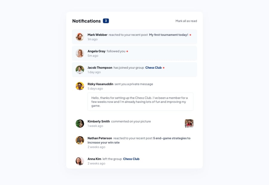
I had trouble width one notification on the mobile side of things. Had to use a max-height on it to make the content not overflow onto the other notifications and it turned out ok but I'm still unsure about it. Its the one with css id, #rizkyProfile . Any help on it would be appreciated! :)
Community feedback
Please log in to post a comment
Log in with GitHubJoin our Discord community
Join thousands of Frontend Mentor community members taking the challenges, sharing resources, helping each other, and chatting about all things front-end!
Join our Discord
