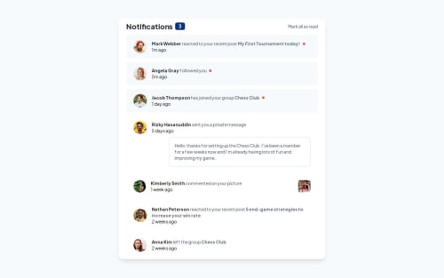
Notification Page [React - Next.js - Tailwind CSS]

Solution retrospective
In general, I am very happy how the solution turned out. I decided to challenge myself even more and implemented the following:
- Dynamic notifications loading, instead of hardcoded html;
- Universal template for each notification item, that adapts based on the data passed for the respective notification;
- Added functionality to click on unRead notification so it can be changed to Read.
Next time I would like to be faster and hopefully include more real life scenarios and best practices.
Built with
- React / Next.js 14
- Mobile first approach
- Tailwind CSS
- Responsive design with Mobile, & Desktop view
I am not very experienced with state managements libraries in React, so I used the "natural" parent to children relationships.
I hope the code is fine enough, but in the processes I had some issues when implementing the logic for mark all as read and click to mark as read.
Thankfully this was very rewarding once completed and I am happy with the result.
What specific areas of your project would you like help with?Any and all feedbacks are welcome!
I would much appreciate any suggestions that will update my code to the "best-practices" and make it more efficient and easy to maintain!
Please log in to post a comment
Log in with GitHubCommunity feedback
No feedback yet. Be the first to give feedback on DeyanTopalov's solution.
Join our Discord community
Join thousands of Frontend Mentor community members taking the challenges, sharing resources, helping each other, and chatting about all things front-end!
Join our Discord