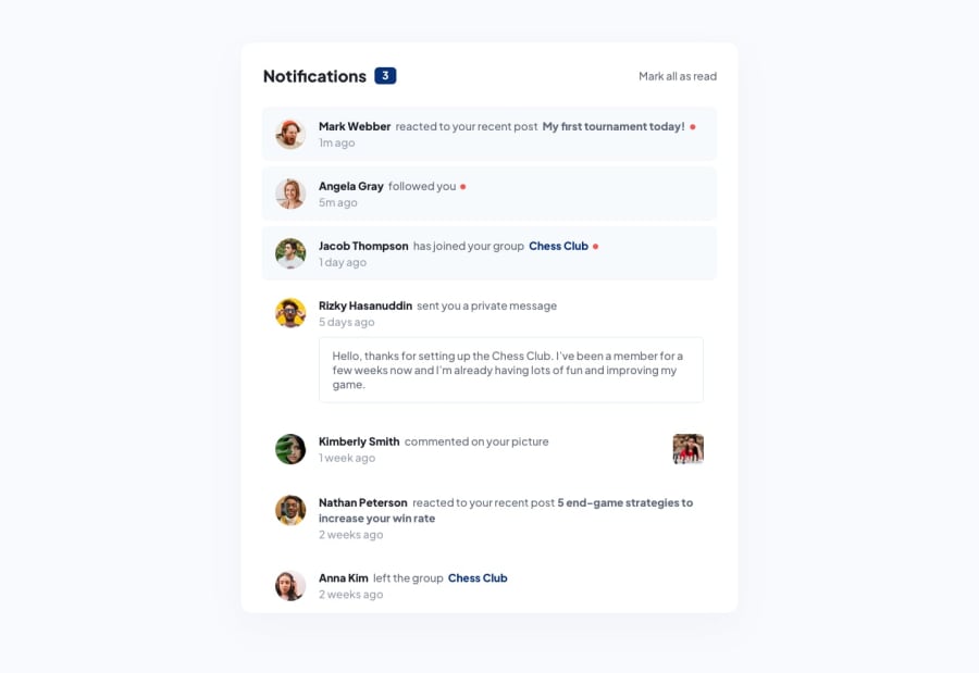
Design comparison
Solution retrospective
this is a notification page let me know what you think and how i can make an improvement to it
Community feedback
- @0xabdulkhaliqPosted over 1 year ago
Hello there 👋. Congratulations on successfully completing the challenge! 🎉
- I have other recommendations regarding your code that I believe will be of great interest to you.
HEADINGS ⚠️:
- This solution has also generated accessibility error report due to lack of level-one heading
<h1>
- Every site must want at least one
h1element identifying and describing the main content of the page.
- An
h1heading provides an important navigation point for users of assistive technologies, allowing them to easily find the main content of the page.
- So we want to add a level-one heading to improve accessibility by reading aloud the heading by screen readers, you can achieve this by adding a
sr-onlyclass to hide it from visual users (it will be useful for visually impaired users)
.
I hope you find this helpful 😄 Above all, the solution you submitted is great !
Happy coding!
Marked as helpful1@Hola-Code001Posted over 1 year agoThanks your feedback is really helpful @0xAbdulKhalid
0 - @LysitheaDarkKnightPosted over 1 year ago
Hello, how are you? Good job on completing the challenge!
-
You did not need to define
width: auto! This is becausewidthdefault value is set toauto. So the width can be left as it is. -
You can define a
borderforprivate messageby setting(number)px solid (any color). You may already know this, but this was present in the design preview so I wanted to point that out. You also definedborder-radiustwice for default and hover states for this element so you can remove it for hover state.
Happy coding!
1 -
Please log in to post a comment
Log in with GitHubJoin our Discord community
Join thousands of Frontend Mentor community members taking the challenges, sharing resources, helping each other, and chatting about all things front-end!
Join our Discord
