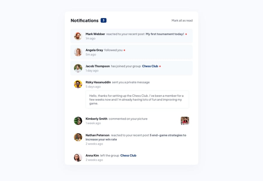
Design comparison
Solution retrospective
Hello everyone!
This project was pretty easy. I attempted to do it with Objects instead of regular functions and I'm pretty pleased with the results.
Upon clicking any username or one of the bolded events, it will reduce the counter by 1 whereas clicking the "Mark all as read" will reduce it to 0. I also added simple timing functions to the counter so that it doesn't immediately change. I look forward to your feedback!
Michael Johnson
Community feedback
- @danielmrz-devPosted 9 months ago
Hello @mikej321!
Your project looks great!
I have one suggestion for you to improve it even more:
- Using
marginis not the best option to center an element. Here's a very efficient (and better) way to place an element in the middle of the page both vertically and horizontally:
📌 Apply this to the body (in order to work properly, don't use position or margins):
body {
    min-height: 100vh;
    display: flex;  /* it works with grid too  */
    justify-content: center;
    align-items: center;
}
I hope it helps!
Other than that, great job!
Marked as helpful0@mikej321Posted 9 months ago@danielmrz-dev Thanks for your suggestion, Daniel! I wasn't trying to center it, normally I do center it with flexbox but in the project files, it didn't seem centered to me so I didn't do it. Although looking at the project through a second lens, it does seem as though it would be centered if it were bigger :). Thanks very much for the suggestion, I need to change some things haha.
Michael Johnson
1 - Using
Please log in to post a comment
Log in with GitHubJoin our Discord community
Join thousands of Frontend Mentor community members taking the challenges, sharing resources, helping each other, and chatting about all things front-end!
Join our Discord
