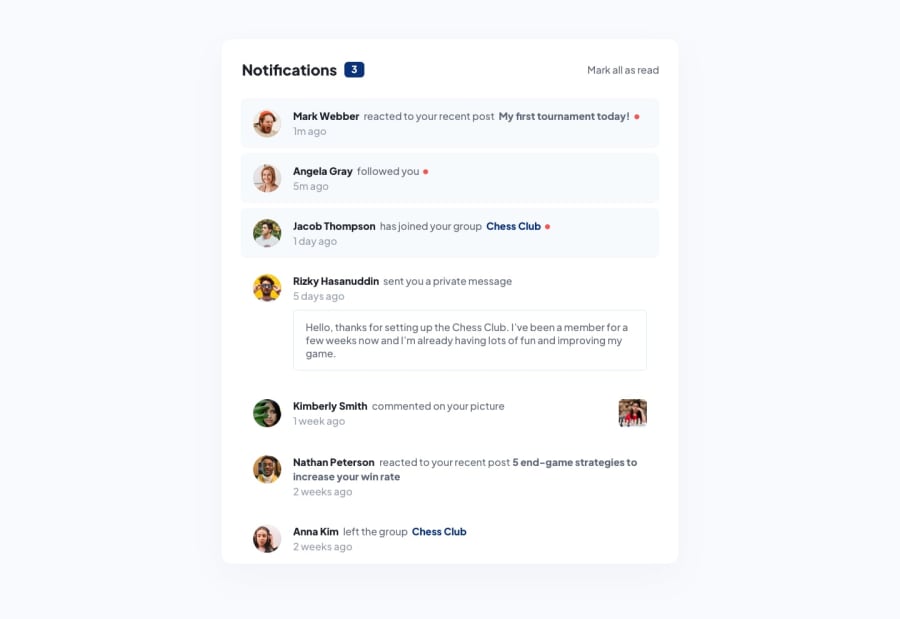
Design comparison
Solution retrospective
I'd love to see your constructive feedback upon my project
Community feedback
- @asbhogalPosted over 1 year ago
Hi there,
Good work! I can see you've made a solid attempt at matching to the mockups. I've noticed several things however which are worth considering for refactoring this:
- You can use the font-clamp() property to dynamically scale down the
font-sizefrom a value set at a high viewport width down to the the lowest set viewport width inrem(note that this assumes a basefont-sizeof16pxwhich is suitable generally, but it's worth noting in larger applications this would require further adjustments.) Here's a link to generate the function Link - Your markup is also semantically incorrect. The
<header>should always be at the top, outside any other element (except thebody) and your main content should be wrapped in the<main>element to mark where the most interactive content is (important for accessibility.) You could remove the two<div>elements and style the first two I mentioned. - It's great to see that you've locally hosted your font, however this should be in
.woff2format as this is designed for the web. Here's a link explaining this in further detail Link - Your
<img>elements are missingaltattributes, which are important for screen readers and other assistive technologies to be able to read them to establish their purpose and context - Avoid using
varwhen declaring variables - I noticed this in yourvar classname = span.getAttribute('class');. This should beconstseeing as it isn't being reassigned within the same scope
Hope this helps!
Marked as helpful1@jr19981010Posted over 1 year ago@asbhogal Hello Aman! Nice review. But please enlighten me. if I remove the height: 100vh, the container would not be centered vertically.
1@asbhogalPosted over 1 year ago@jr19981010 hi there, I had a look again at your code and made an error, the
min-height: 100vhlooks fine in this case. (The responsive viewer I used in dev tools was cutting off the content, not the app itself.) My apologies, I've edited my original comments to reflect this. Thanks for mentioning.1@jr19981010Posted over 1 year agoheight: 100vhthis is the original property. I just changed it tomin-height: 100vh. Thank you also for the information about clamp().I learned a lot from your feedback.0 - You can use the font-clamp() property to dynamically scale down the
Please log in to post a comment
Log in with GitHubJoin our Discord community
Join thousands of Frontend Mentor community members taking the challenges, sharing resources, helping each other, and chatting about all things front-end!
Join our Discord
