Design comparison
Solution retrospective
Hello,
This is my second challenge I post and I had some fun on JS particularly 😀
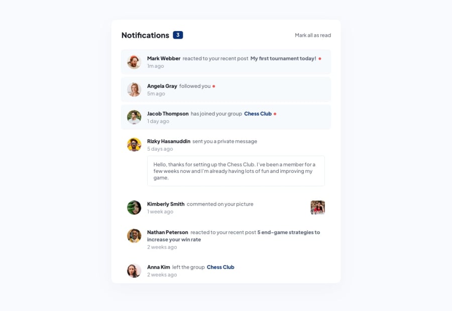
Indeed, to get my hands more in JS I pushed the challenge a little bit further than the initial brief so on top of toggle the visual state of the unread notifications and set the number of unread messages to zero on click on the "Mark All Read", the visual state toggles as well one by one + the unread messages counter decreases as well one by one on click of the selected unread notification div. It allowed me to better understand some javascript notions such as event.currentTarget.
On css I did not managed to have the dot aligned baseline with the text (maybe using grid would have been better than flexbox?) + I am not very sure about my responsive coding part.
Any advice on this is welcome.
Thanks and happy week-end 🐱
Community feedback
Please log in to post a comment
Log in with GitHubJoin our Discord community
Join thousands of Frontend Mentor community members taking the challenges, sharing resources, helping each other, and chatting about all things front-end!
Join our Discord
