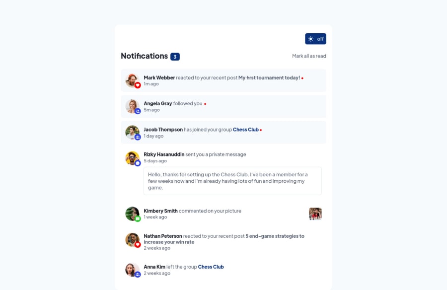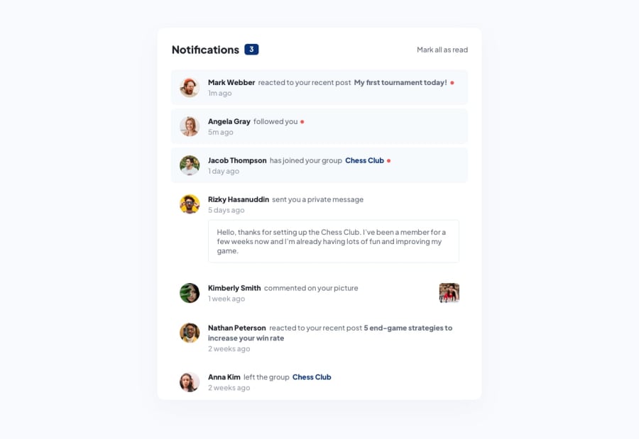
Design comparison
Solution retrospective
So I wrote a lot of code for this challenge 😅. It took me a while to figure out how the components should fit together (might still not be best approach).
Notes
-
I made the app in such a way that along with the red dot that shows the unread state of a notification, if you clicked on a notification, the notification count is re-rendered so the user knows the amount of unread notifications he/she has
-
My logic for storing and retrieving the stored theme from local storage was definitely not the best . Any ideas on how I could make this better would be appreciated
-
I tried as much as possible to make the solution as accessible as possible.
Inspiration for this project
-
@AdrianoEscarabote for the inspiration of the dark mode feature. I used the inspect tool to get the colors for the background and the purple colour too.
-
@karolbanat for his beautiful solution that inspired me
Community feedback
Please log in to post a comment
Log in with GitHubJoin our Discord community
Join thousands of Frontend Mentor community members taking the challenges, sharing resources, helping each other, and chatting about all things front-end!
Join our Discord
