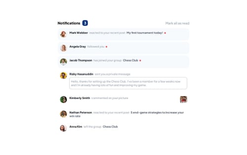
Notification page

Solution retrospective
I added a simple pulsing animation for unread markers and event which marks notification as read when user hover mouse over them. Maybe it's a bit unnecessary. But still cool.
What challenges did you encounter, and how did you overcome them?I tried to implement dynamic render of the notifications. To do this, I made a class which contains render algorithm. But I couldn't figure out how to make it leaner. Guess I violated DRY rule a couple of times.
What specific areas of your project would you like help with?This project got me thinking how to make those notifications more accessible. How can I inform tools like screen readers about unread notifications? Should I add tag like "aria-label" to unread notification? Or, maybe to badge which display their number? I'm interested in any suggestions and opinions.
I didn't add aria tag for now cos as Aristotle said, "No ARIA is better than bad ARIA" (or it was Newton?).
Beside that any suggestions are welcomed.
Please log in to post a comment
Log in with GitHubCommunity feedback
No feedback yet. Be the first to give feedback on Alex's solution.
Join our Discord community
Join thousands of Frontend Mentor community members taking the challenges, sharing resources, helping each other, and chatting about all things front-end!
Join our Discord