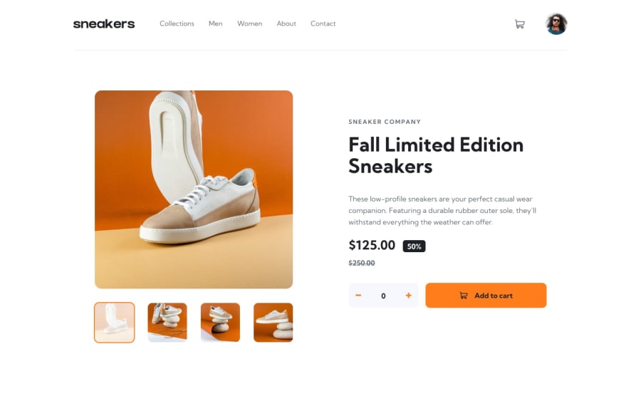
Design comparison
SolutionDesign
Community feedback
- @WondahsPosted 3 months ago
This is an amazing solution.
I would like to suggest the following improvements:
- Increase the width, to hide the black sections at the edges.
- When in preview mode, clicking away from the images should hide the preview
Marked as helpful0
Please log in to post a comment
Log in with GitHubJoin our Discord community
Join thousands of Frontend Mentor community members taking the challenges, sharing resources, helping each other, and chatting about all things front-end!
Join our Discord
