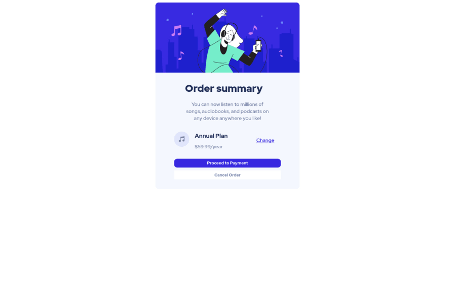


Design comparison

Solution retrospective
I really dont understand how to make websites both for desktop and for phones. Also I had a problem with 'Change'-link: position 'absolute' makes it really strange. But its the best I could make
Please log in to post a comment
Log in with GitHubCommunity feedback
- @guztrillo
Don't give up yet. Try to learn about Media Queries and responsive design. You can even made a responsive design page without using media queries at all.
Marked as helpful - @annab6
Hi! I advise you to see this video of Colt about media queries, it helped me a lot with building a responsive layout https://www.youtube.com/watch?v=na-X_SM8vg0 Happy Coding!
Marked as helpful - @Amirmardan-prog
If I'm not wrong the repository for this project is called "sn". Look to make it responsive, you should use
@media (max-width: <viewport size>){}in your css file. have a look at https://www.w3schools.com/css/css3_mediaqueries_ex.asp and https://developer.mozilla.org/en-US/docs/Web/CSS/@mediaMarked as helpful - @FluffyKas
Hey, it would be nice if you linked your github repository, so we can take a look at your code :) The repositories l see at your profile don't really have descriptive names either.
Marked as helpful


Join our Discord community
Join thousands of Frontend Mentor community members taking the challenges, sharing resources, helping each other, and chatting about all things front-end!
Join our Discord