

Design comparison

Solution retrospective
Please provide feedback. It will help me to improve my skills.
Community feedback
- @SamadeenPosted almost 3 years ago
Hey!! Cheers 🥂 on completing this challenge.. .
Lets firstly work on your accessibility issues.
-
Document should have on main landmarkbasically means your html should be structured more semantically and the correct format should be your<header>......</header>followed by your<main>......</main>and lastly your<footer>....</footer>hence you should use<main class="img-qr">instead of<div class="img-qr">. -
Your
footershould be<footer class="attribution">instead of<div =attribution> -
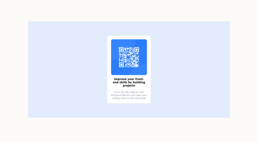
Page should contain a level-one headingbasically means yourhtmlshould have ah1it aid navigation hence<p class="bold-para">Improve your front-end skills by building projects</p>should be<h1 class="bold-para">Improve your front-end skills by building projects</h1>and you should also go down orderly when you are using the headings h1 down to h2 down to h3 and so on. -
Images must have alternate text- Its hard for screen readers to pick up messages from images withoutalttext.. Its always advisable to includealttext to aid screen reader
This should fix most of your accessibility issues.
. Regardless you did amazing... hope you find this helpful... Happy coding!!!
Marked as helpful0 -
- @PayalSasmal10Posted almost 3 years ago
Hi, Thank you so much for your help. It actually helped me to understand more.
0 - @Elkordy-egPosted almost 3 years ago
it is not the same look
you should make the main section 100vh then make a container inside with 320px for example then center it check my code
0


Please log in to post a comment
Log in with GitHubJoin our Discord community
Join thousands of Frontend Mentor community members taking the challenges, sharing resources, helping each other, and chatting about all things front-end!
Join our Discord