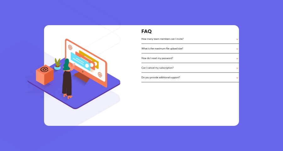
Design comparison
SolutionDesign
Solution retrospective
I concentrated on the JS, even is the smallest part.
I had 2 problems here, First is the big scroll i have, due to the background img size. I tried to reduce the height but doing it the design was not as in the example picture. Second one is about the z.index. There are parts of the images that shouldn't be visible, i tried to do it with z-index but i needed to put the position relative (mines are absolute), and with realtive the scroll was even bigger.
Please log in to post a comment
Log in with GitHubCommunity feedback
No feedback yet. Be the first to give feedback on Ric's solution.
Join our Discord community
Join thousands of Frontend Mentor community members taking the challenges, sharing resources, helping each other, and chatting about all things front-end!
Join our Discord
