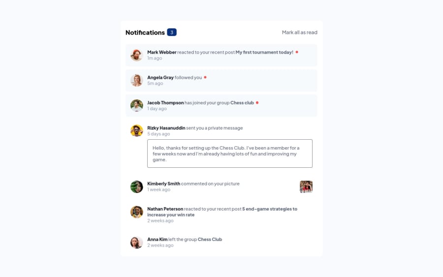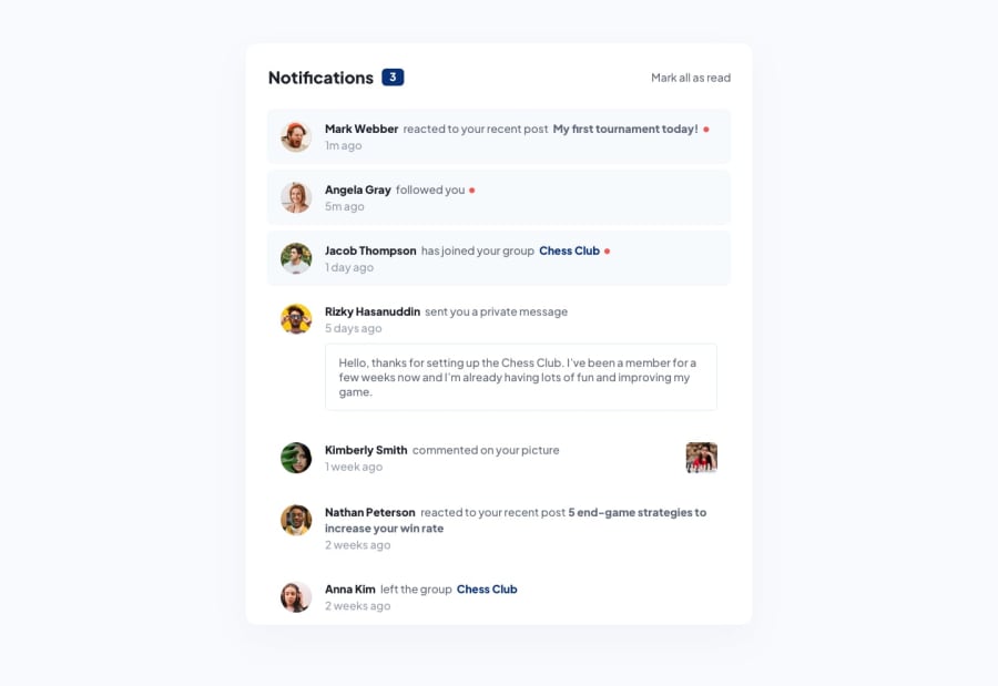
Design comparison
SolutionDesign
Community feedback
- @antonADevPosted about 2 years ago
Hi Titouan... First of all congratulations for finishing the challenge 🎉. The overall work is pretty amazing, there are just some minor issues:
- The background color of your solution is a bit darker then the given design. Play a bit around with your css and the given style properties, and you will achieve this in a couple of seconds.
- It has a couple of size issues, overall width and some styling for your links.
But again, very impressive work and you have to be proud of yourself.
Hope my answer will help you to improve your skills and keep coding 😊
Marked as helpful0@titouanckPosted about 2 years ago@antonADev Thanks. For size issues, I actually often have trouble matching the model: if you have any tips to make it easier, I'm all ears!
0
Please log in to post a comment
Log in with GitHubJoin our Discord community
Join thousands of Frontend Mentor community members taking the challenges, sharing resources, helping each other, and chatting about all things front-end!
Join our Discord
