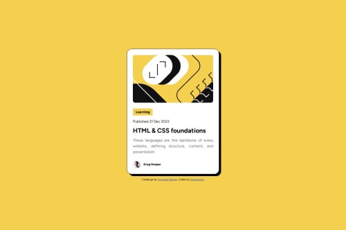
Nostromito Blog Preview

Solution retrospective
I am proud that I was able to complete this in general. I felt like I am a world beyond what my last project was. Next time I would like to rely less on resources and focus more on completing it myself.
What challenges did you encounter, and how did you overcome them?My biggest challenge this time around was making the website responsive to smaller devices. After a little digging I found using min-height and max-width makes all the difference and saves me from having to use multiple media queries.
What specific areas of your project would you like help with?Just an over view of what I did right and what I still need to work and is all the help I could ask for.
Please log in to post a comment
Log in with GitHubCommunity feedback
No feedback yet. Be the first to give feedback on Nostromito's solution.
Join our Discord community
Join thousands of Frontend Mentor community members taking the challenges, sharing resources, helping each other, and chatting about all things front-end!
Join our Discord